
Starbucks in your pocket
- Year2018 — 2019
- Disciplineuiux, illustration, interaction
- Asset CreditsStarbucks


Refreshing a globally recognizable brand
We all know and love Starbucks - instantly recognizing what the brand stands for and what their core elements are without skipping a beat. We know what the “Starbucks lifestyle” looks like which got us thinking: why doesn’t the app match the store? We felt the app fell short to the actual Starbucks experience and didn’t do it justice.

Colours that smell like coffee
Maintaining Starbucks’ signature green, we took inspiration from their store’s colours to introduce a palette of warm-tone greys, browns, and golds. The colours exude Starbucks’ luxe exteriors and interiors and we wanted it to remind you of coffee, so much you can almost smell it.
.


Dripping with functions and features
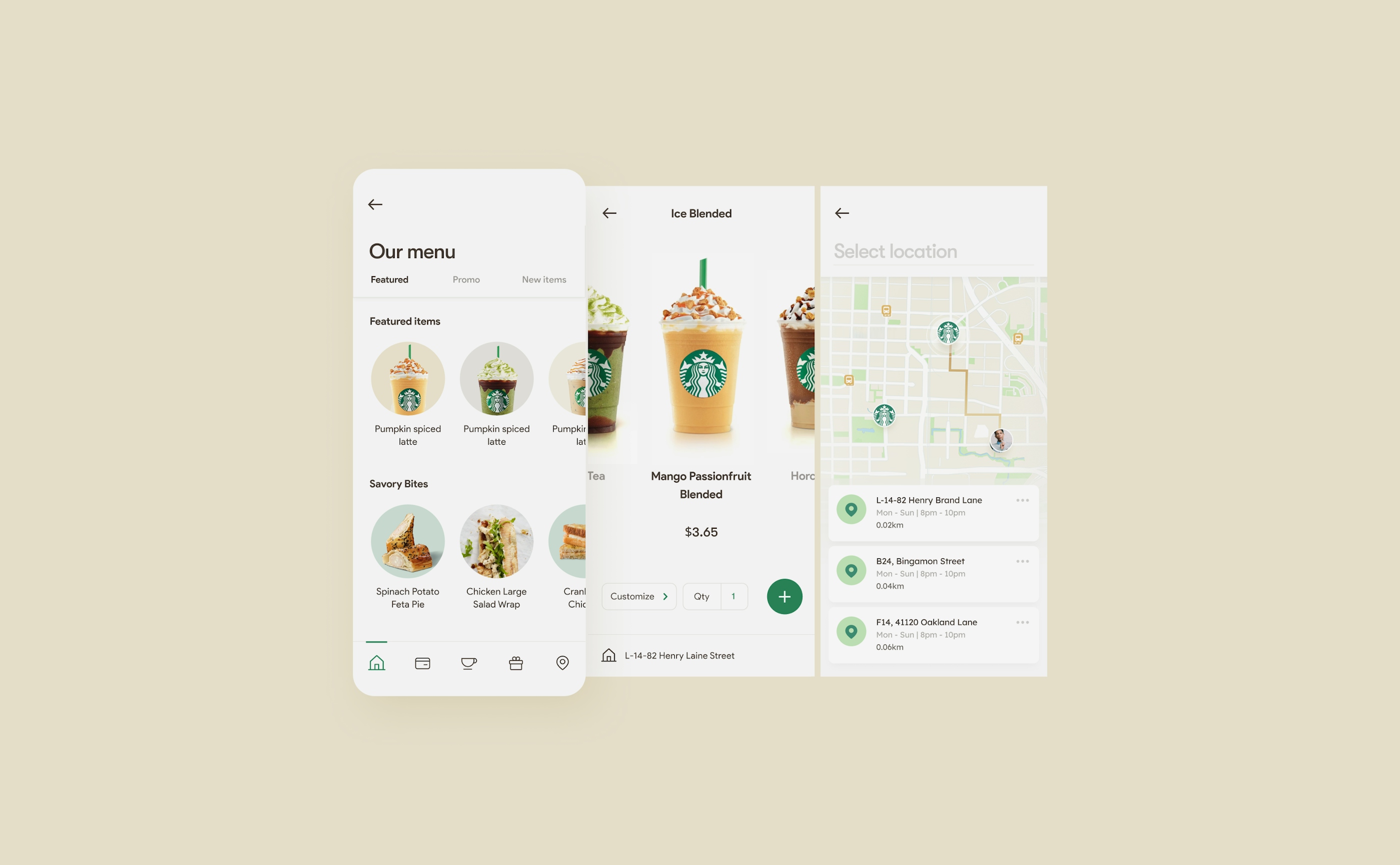
Beyond just the existing features, we wanted the app to make it incredibly easy and seamless for you to get your Starbucks fix right from your first sign of craving. Imagine this: You have a sudden craving out of no where. You hit the app. A couple of buttons later, your order is ready to be picked up or delivered. Before your senses hit you, your impulse has already paid. Now, wouldn't that be a dream?
Order customization
We thought it would be super helpful if you could save your favourite drink customization - from the secret menu or otherwise. Plus, if you could make a quick order on your way there or have it delivered, it saves everyone time queueing and gives baristas time to prepare special orders.
.
Card Management
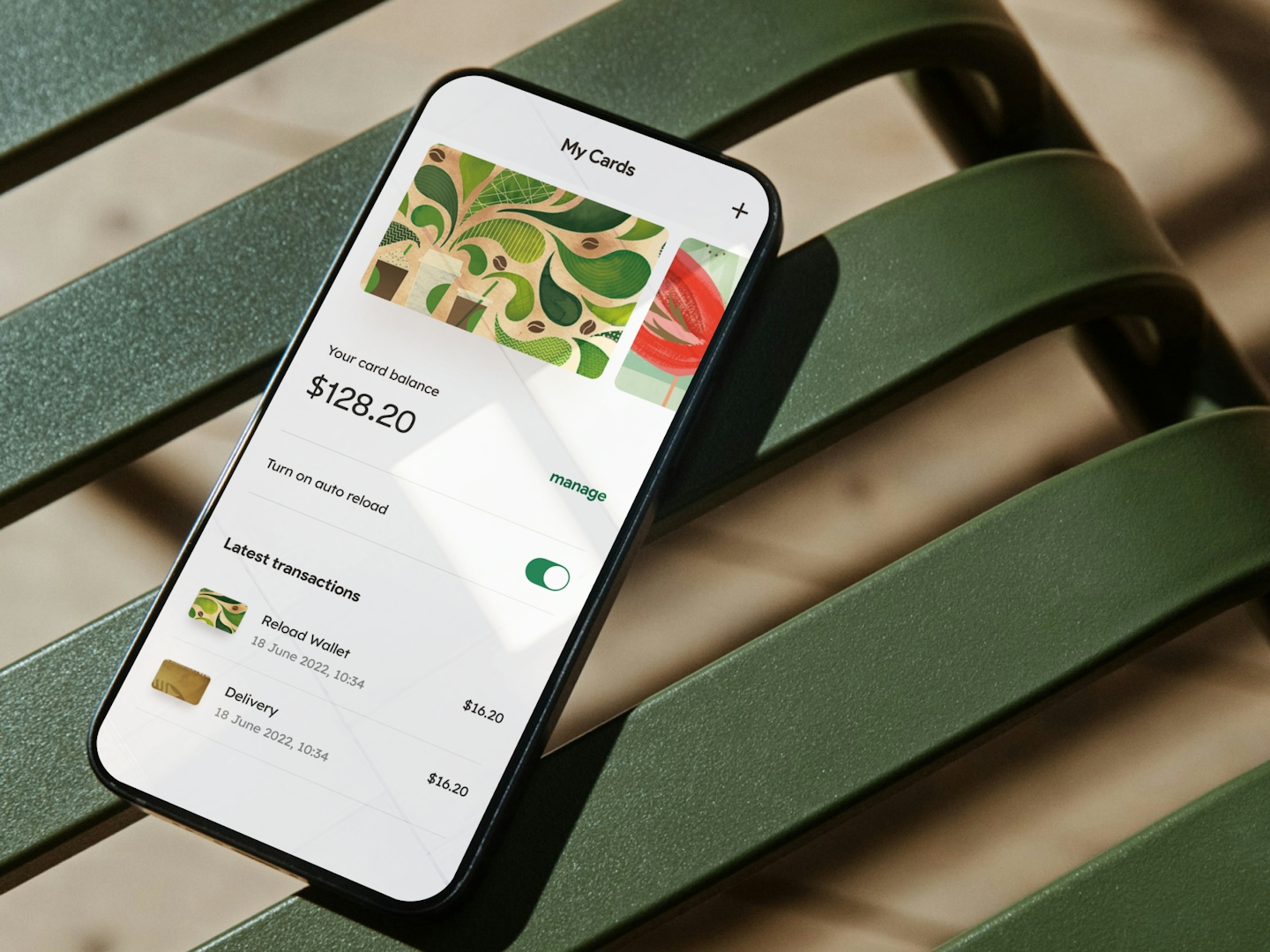
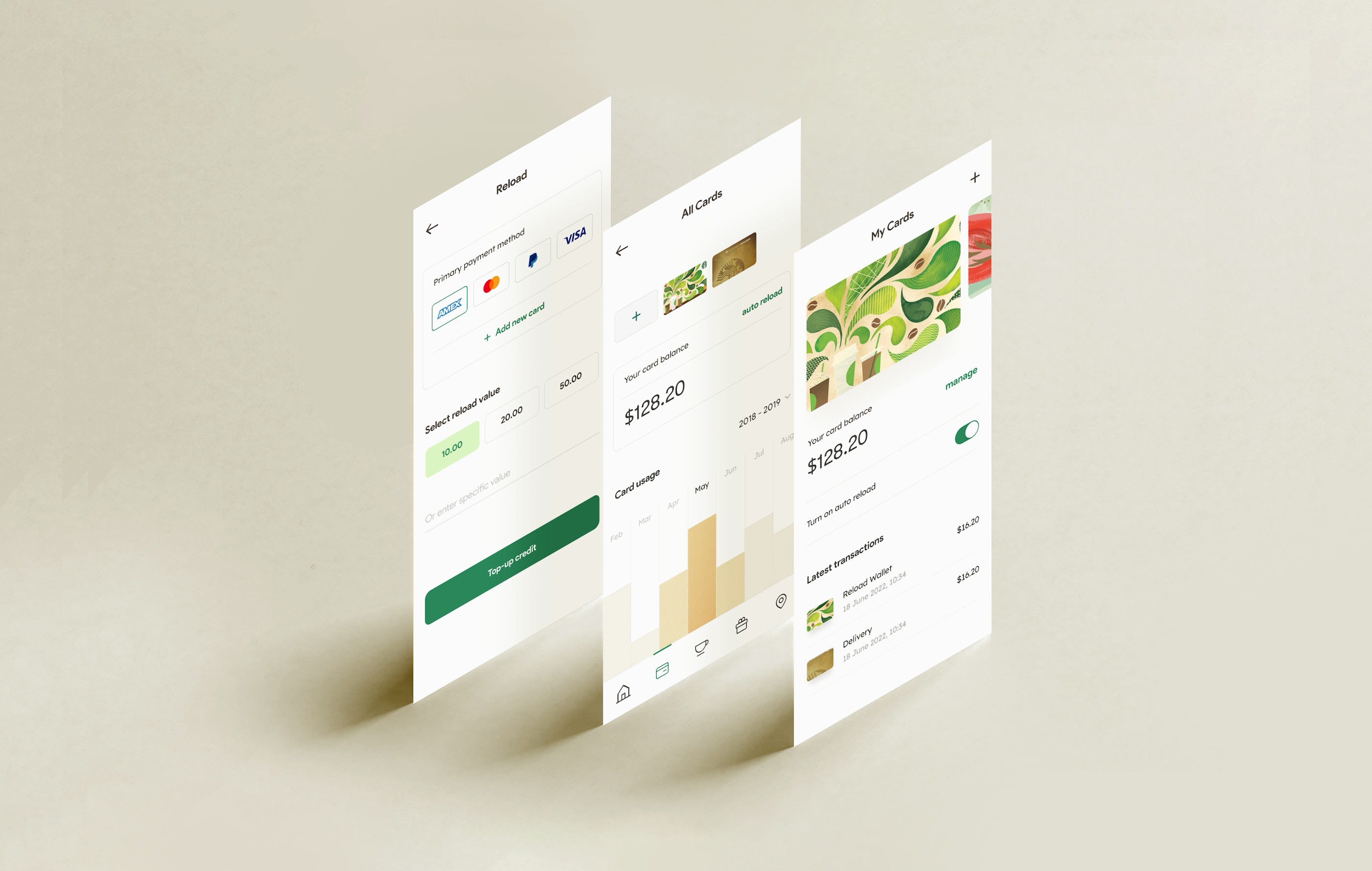
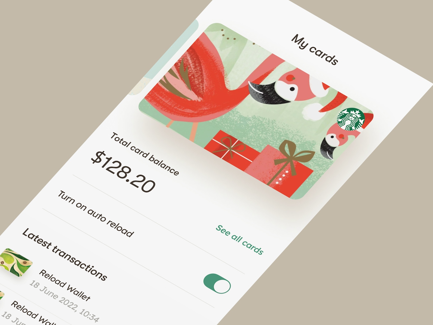
With over 20 years worth of different cards produced by Starbucks, it's no surprise if you have amassed a stack for yourself. The app makes it easy to view them all at a glance; you can reload, check your balances, add or remove cards as you wish.
.
Rewards Redemption
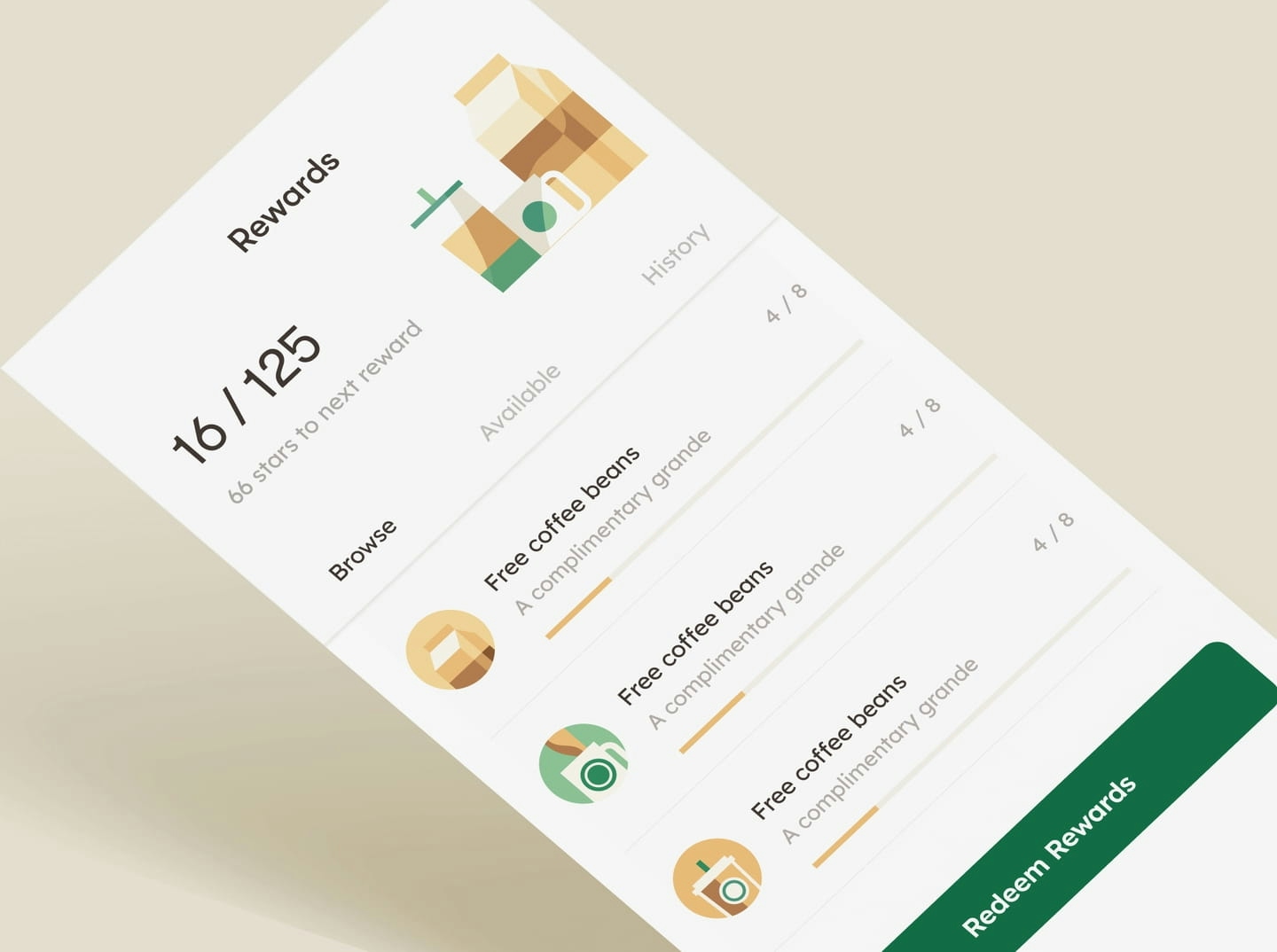
One of the main features in all existing Starbucks app is their Rewards redemption and rightfully so. It's the same familiar redemption screen: progress bars, number of rewards, and more. We took the liberty here to give it a facelift - adding enigmatic illustrations as a mini perk-me-up to your process.
.
.
Delightful as a mid-day brew
.
.
From iconography and illustrations to interaction, we wanted to amplify the enjoyable experience of having a Starbucks through visual cues. The subtle motion designs and custom illustrations bring the app to life and invites you to take a break and enjoy a cup now.


