Reframing the pante system
- ClientUnibottle
- Year2021 - 2022
- Disciplineweb, illustration, interaction

A fresh take on an untouched 40-year old system
The pante system has been around for a long, long time in Scandinavia and some parts of Europe - you collect a bunch of plastic bottles or cans, and bring it to your nearest supermarket to recycle it for 1 kr (for example). The system isn't broken but according to Henrik and Simon, founders of Unibottle, some improvements are necessary. Together, we wanted to rewrite how people think of recycling and give this 40-year old system a little facelift.

Project
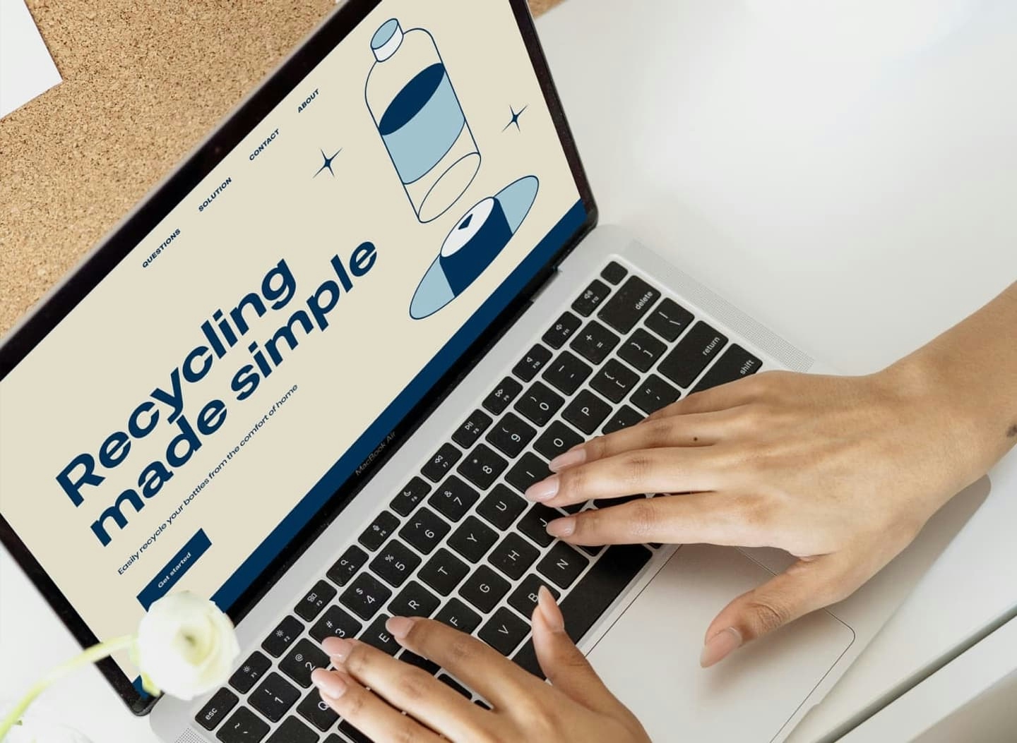
Unibottle is a startup based in Oslo, Norway with the vision to simplify the Scandinavian pante system right from people's homes. Working closely with Henrik and Simon, CEO and COO of Unibottle respectively, we designed a landing page that perfectly reflected the elegance and simplicity of the solution in a fun and engaging way especially for young people living in the city and on campuses.
"
Unibottle has developed a great relationship with Tofu Design! We highly recommend you to work with them; they captured our vision for the project excellently. Tofu Design is polite, detail-oriented, and creative, which comes truly to show through their work ethics and quality. Big thanks to Daphnie and Daniel.
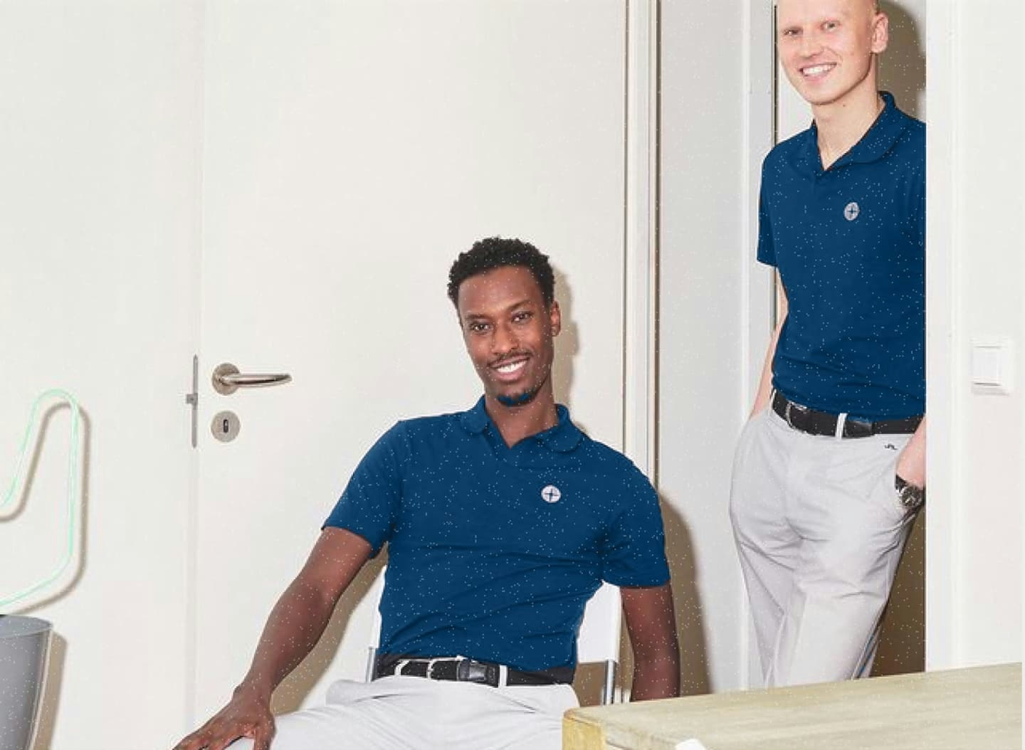
Henrik Hayes + Simon Hauss, co-founder
It's a unified solution with Unibottle
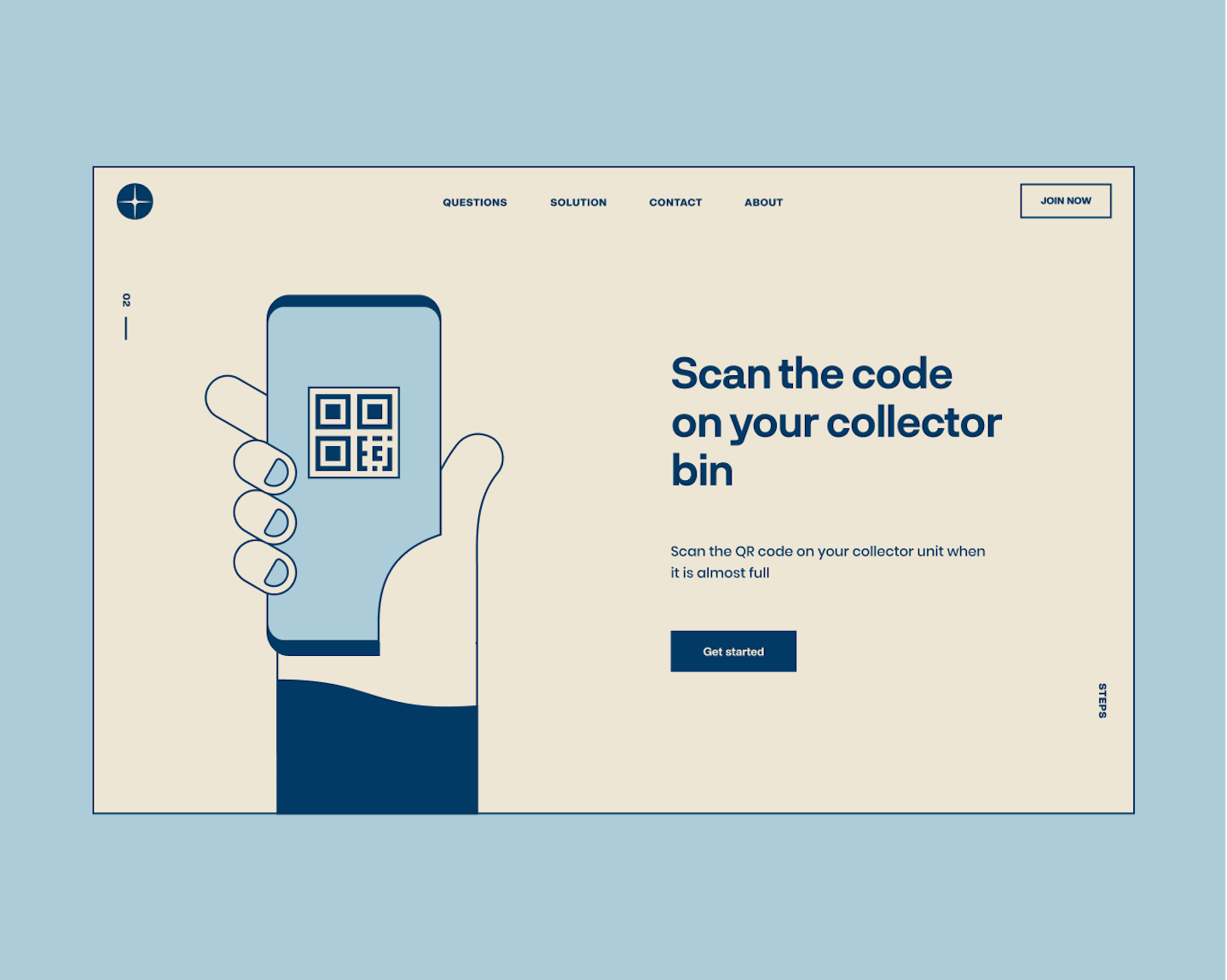
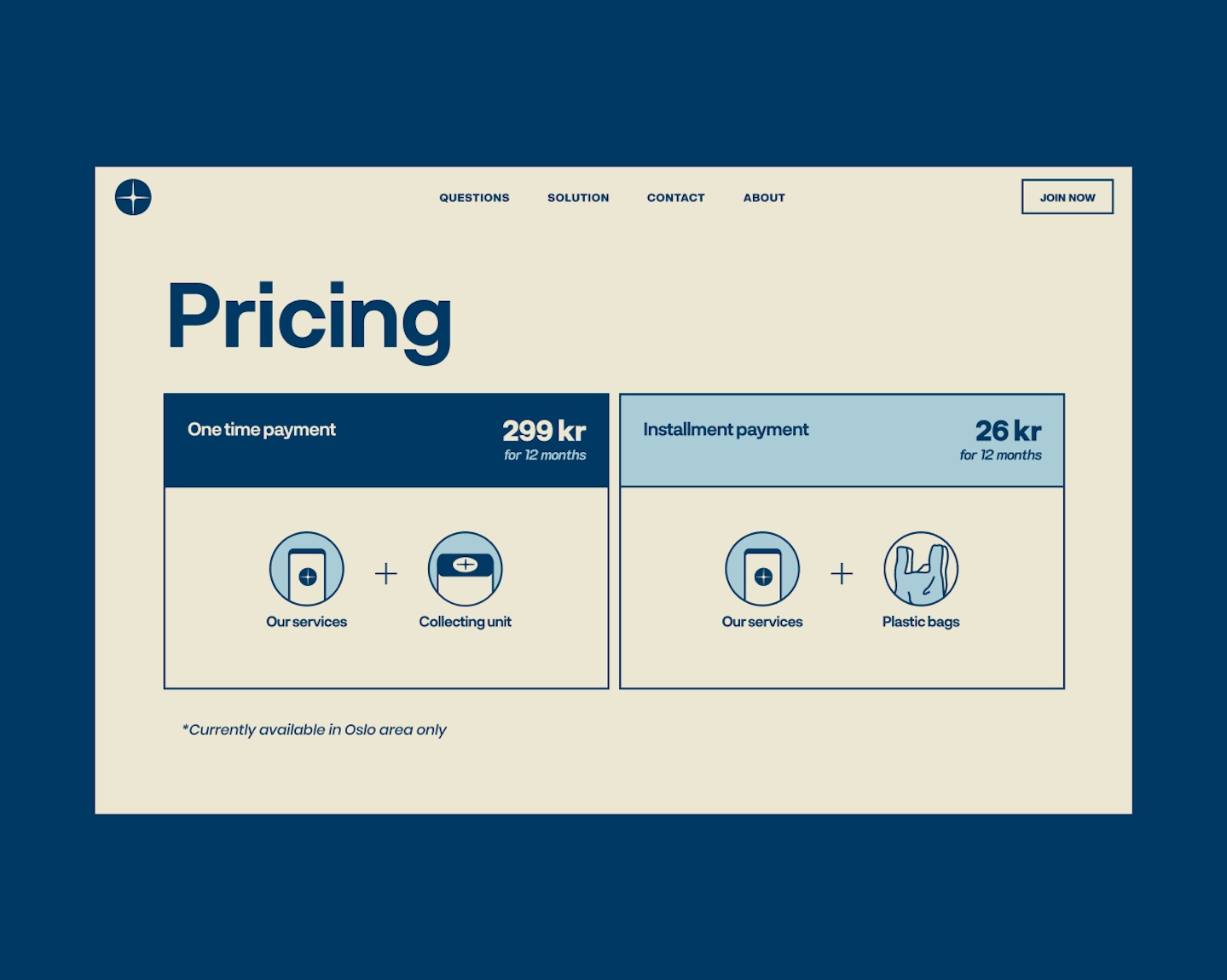
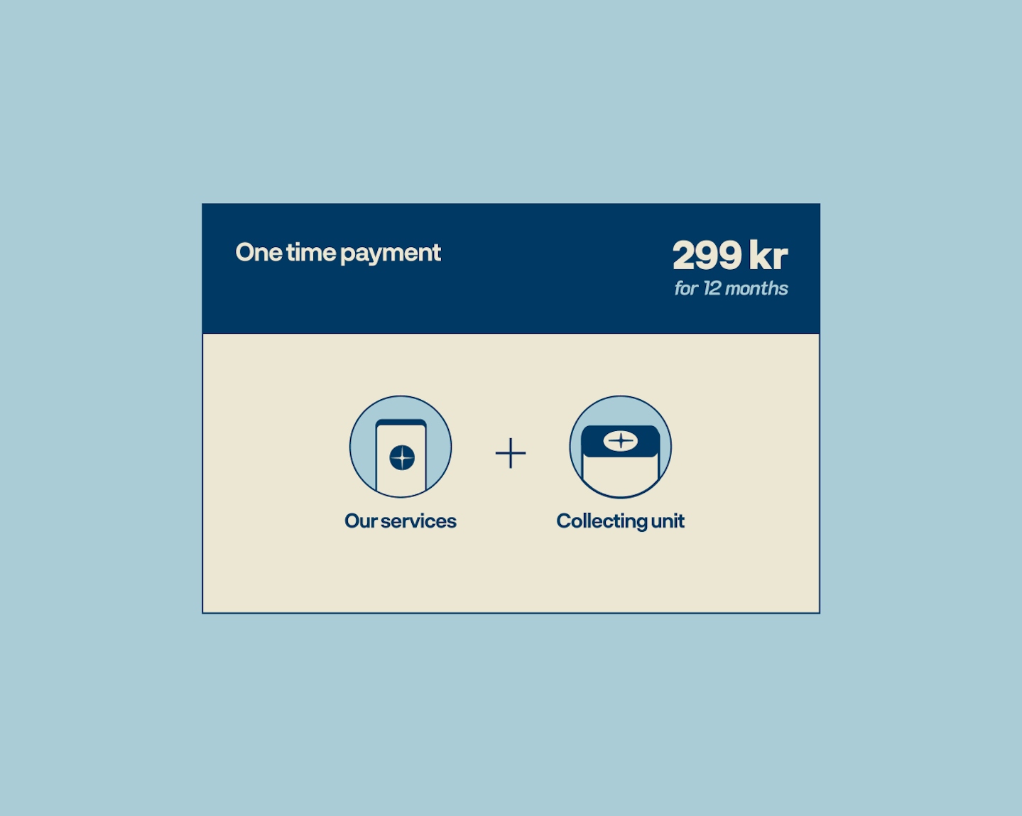
The overarching goal for the landing page was to convey just how easy your life will be with Unibottle. It was integral to the design to showcase the entire process in a seamless manner - slowly feeding bite-sized information to users through sleek interactions. We wanted the site to feel welcoming and easily understood; after all, it is a familiar concept but made simpler.
.
.
Just go with the flow
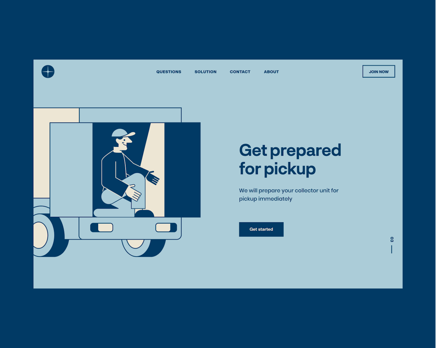
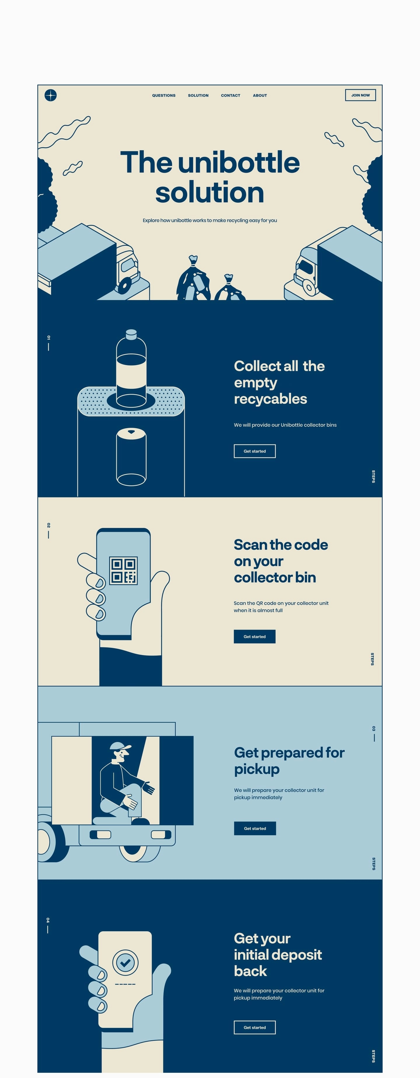
We designed the site to follow the journey of the recyclable, from bin to truck to payment - illustrating how Unibottle starts right from your home and takes care of everything from there. One of our challenges here was ensuring each element coming before and after each other lines up perfectly in order to give that illusion of continuity.
.
.
.
Green without being green
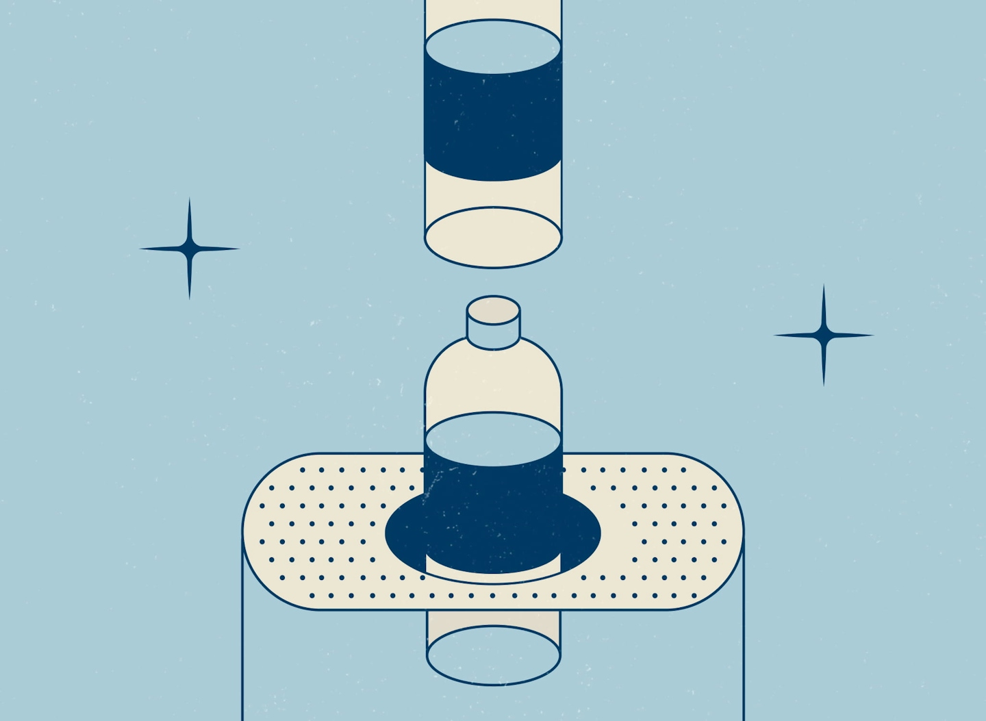
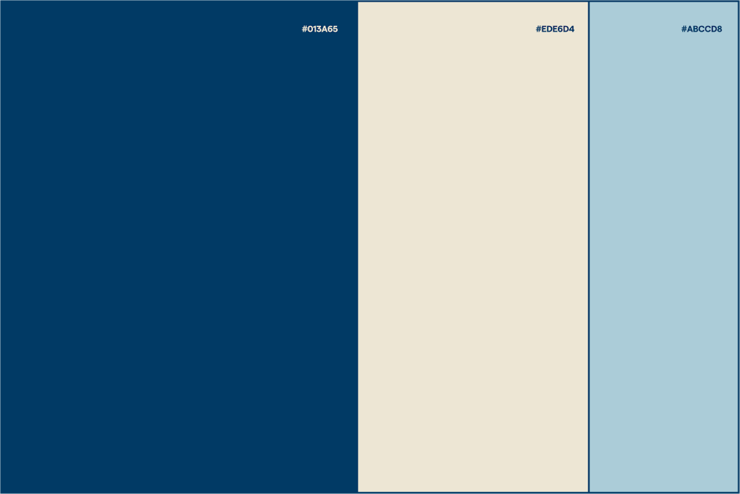
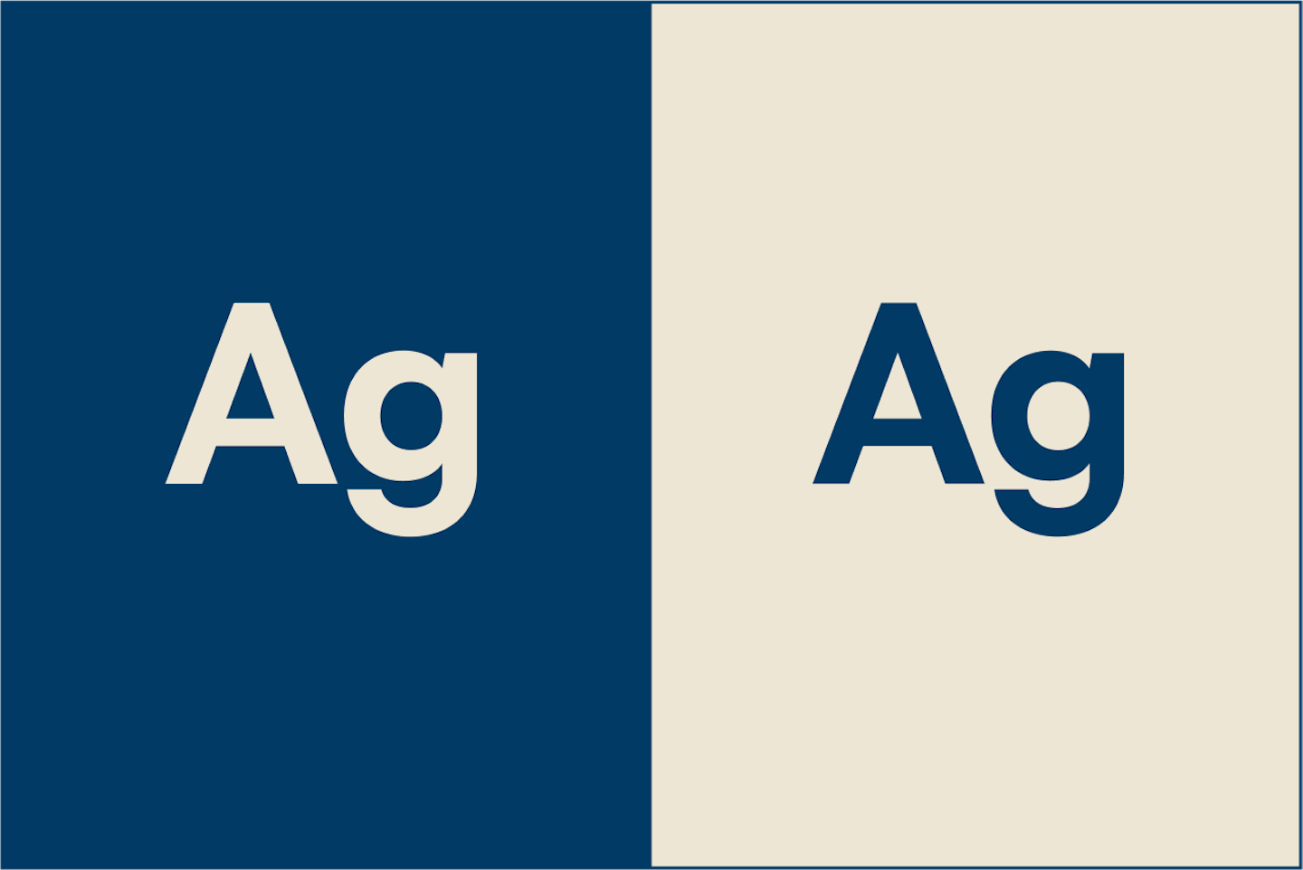
Unibottle came to us with their logo and made it clear to us that they wanted to move away from the stereotypical eco-friendly = green approach. We couldn't agree more. With that in mind, we came up with a limited colour palette of navy blues and creams - an almost retro scheme with a modern twist - a nod to Unibottle's innovaction on a legacy system.
.

