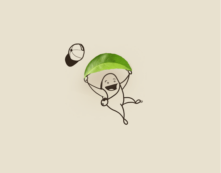
Character design by Juan Montes
.
Selling through storytelling
.
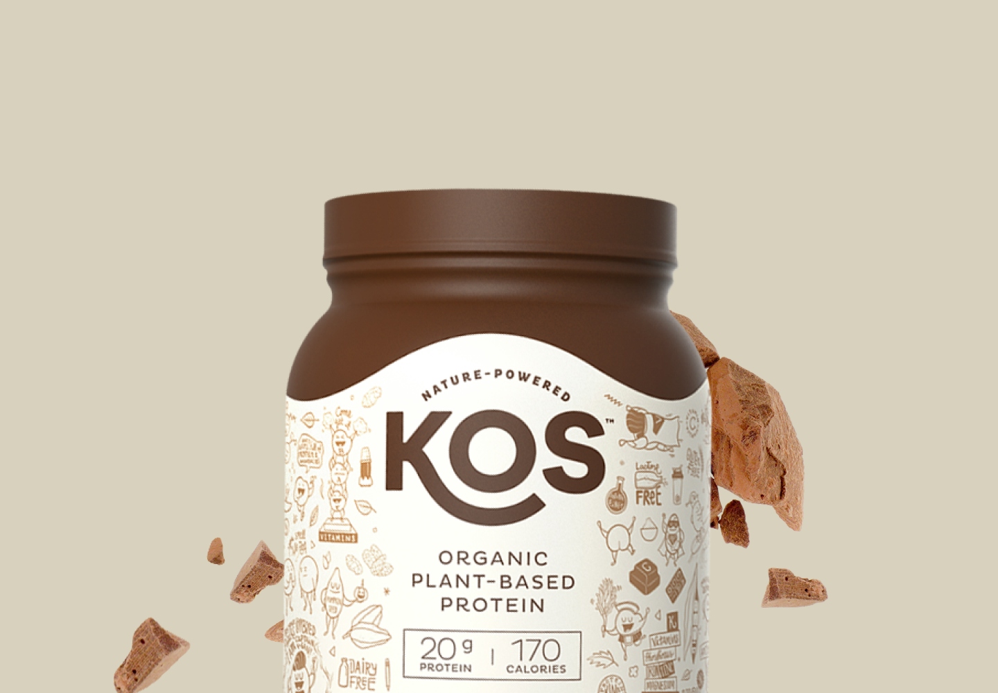
KOS [k-aaw-ss] is a long-time client of ours with the #1 selling plant-based protein powder on Amazon. Since their inception in 2018, they've experienced exponential growth and we're so glad to be a part of their journey so far. When Co-Founder, Allan Stevens, reached out to us in 2018, we were taken by their mission to feed the world without harming the planet. It's simple. It's real. And it's working damn well.
"
Our biggest takeaway from this project is understanding where the intersection between creativity and conversion meets. We're grateful to have explored with KOS the many different ways to showcase their products and still sell without a cookie cutter layout.
Familiar shopping without cookie cutter boxes
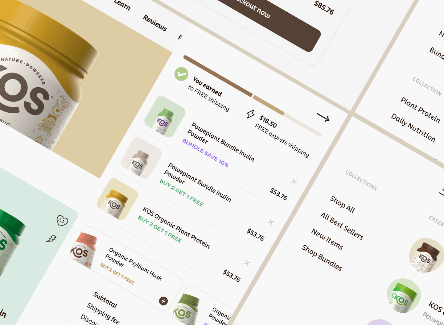
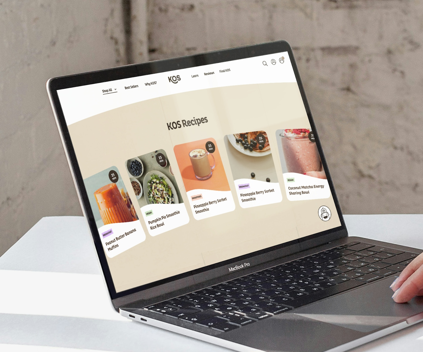
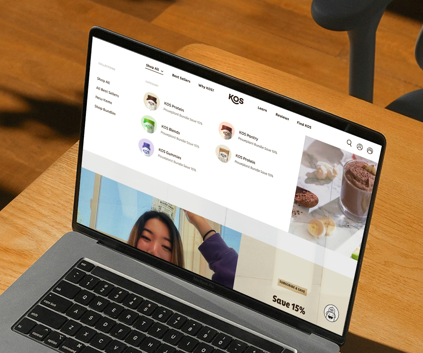
The backbone of KOS' site was to provide a user-friendly shopping experience but without the semblance of a template. With every iterated version, we tried to maintain that same vision while ensuring customers are having a delightful shopping journey. We came in to set the tone for their site and continued to help them expand their colour scheme and visual treatment together with Juan Montes, the brain behind their branding and illustrations.
.
.
Channelling Grecian island vibes
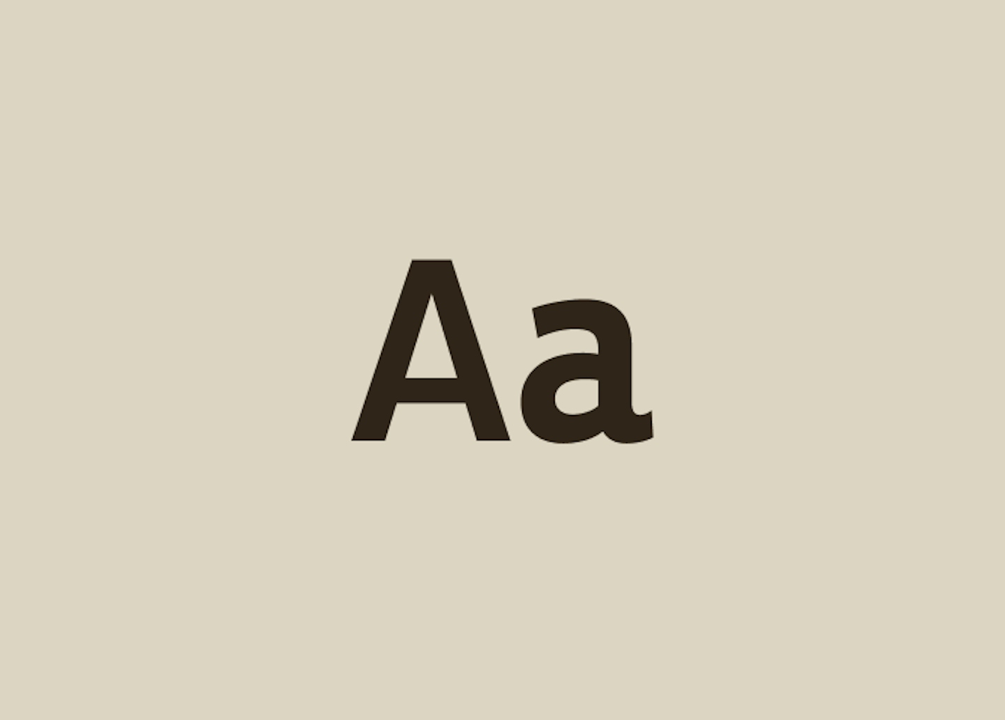
KOS' core colour scheme is largely made of pastel, neutral tones inspired by its Greek island namesake. We expanded the colours to accommodate their ever-growing product line and ever-contagious playful personality. It felt right that such a vibrant brand like KOS should be dotted with more accent colours to also pair with their whimsical Pluto font - the perfect accentuation of their friendly and warm persona.
.
.


.
Onwards to bigger ambitions
.
.
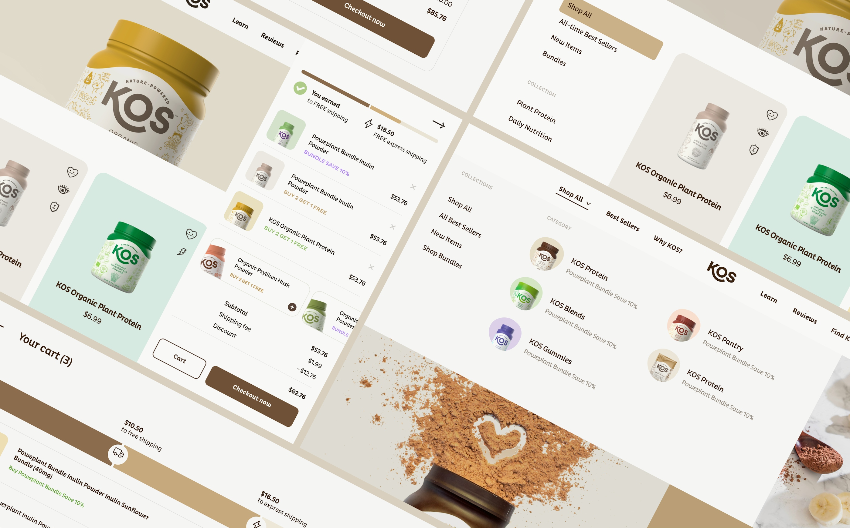
As the brand grew, it outgrew the website as well. In 2021, together with KOS’ CRO Manager, Nolan Heyer, we began restructuring a completely new design system to adapt to KOS’ rapid growth with both user experience and conversion in mind - all while maintaining KOS' distinct personality.
.
.
Feeding America, and then the world
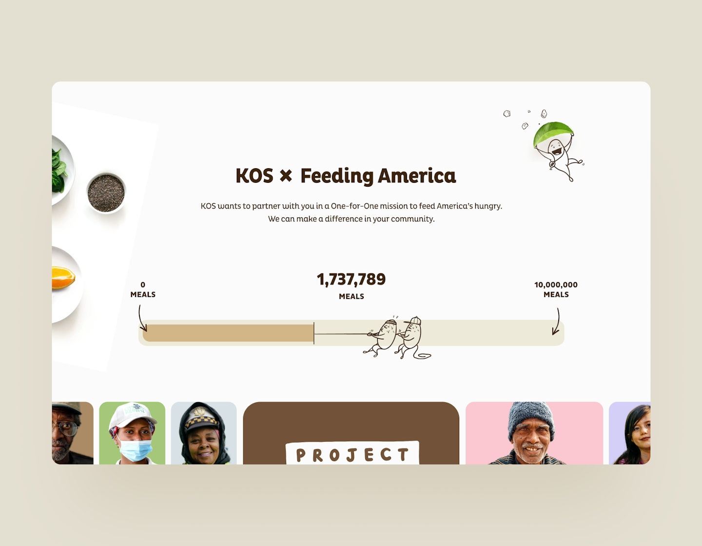
KOS has always had feeding the world as part of their mission. As they move further into realizing this mission, they wanted to highlight one of their main initiatives with Feeding America. It's the "why" that helps customers decide who they want to support so we gave it a grand opening reveal upon scroll - a welcoming gesture to that section so people absolutely can't miss it.
.
.
.
.
An organized cart makes a shopper feel smart
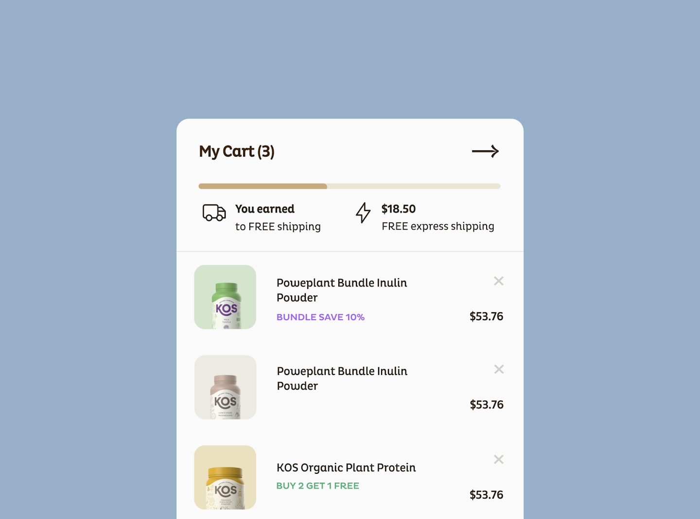
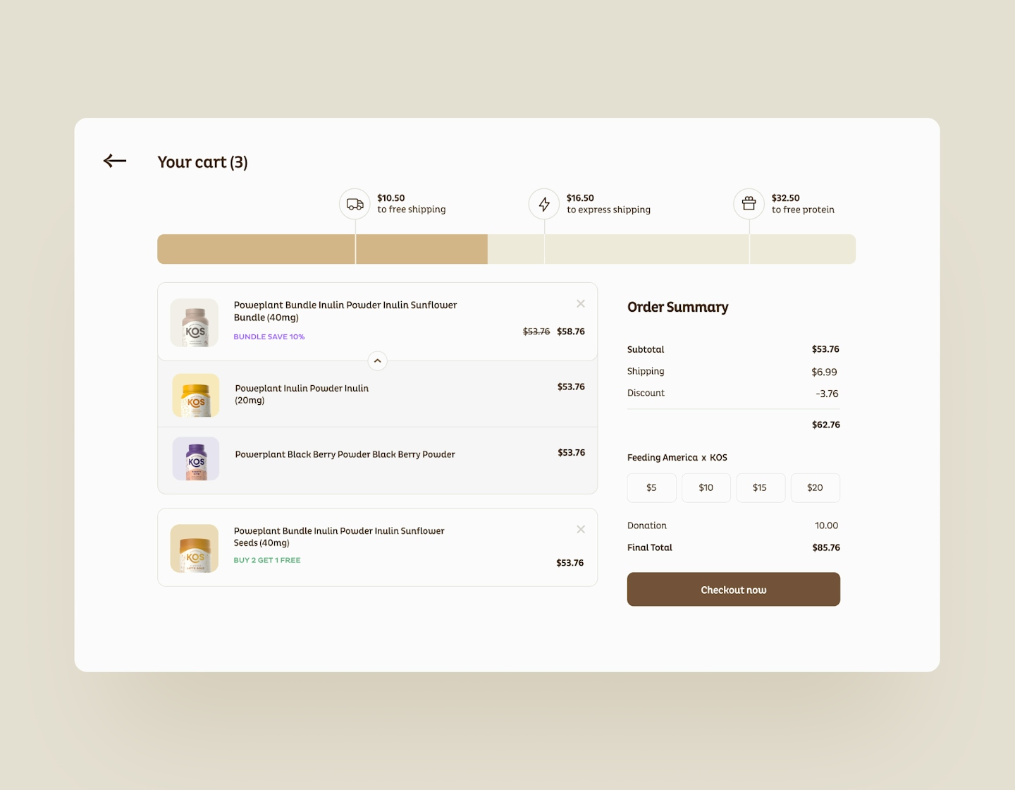
KOS needed an improved cart to accommodate their varied and stacked promotions. It was getting messy and confusing. While it is a small section, it properly challenged our skills as UI designers due to the info overload on such a tiny space. Our solutions is a dropdown to neatly display and label bundle items along with their corresponding promo tags - just like grouped layers - so all promotions and bundles are clean and clear.
.
.
KOS increased conversion rates by 100% in just a short time since it went live.


