Extinction, reframed
- Year2018 — 2019
- Disciplinewebsite, interaction, illustration
- SectorFundraising, Educational

We had one goal in mind when we started this UI/UX project: to tell a compelling and complex story in a palatable and engaging way without intimidation. The climate crisis seemed like the perfect subject simply because it is something that involves humanity as a whole - it's a very real, very tangible, and very relatable problem of our generation. While this is not going to change the world, we think it's an interesting way to get people to start learning and listening about how we can be responsible for climate change.

Doom without the gloom
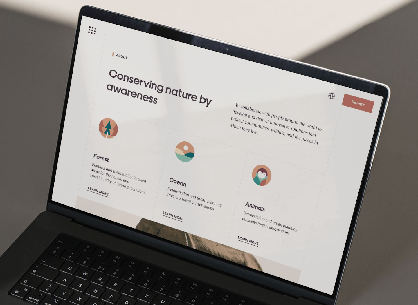
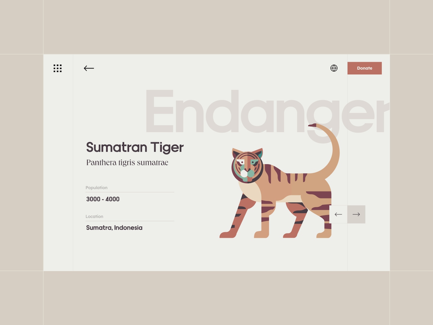
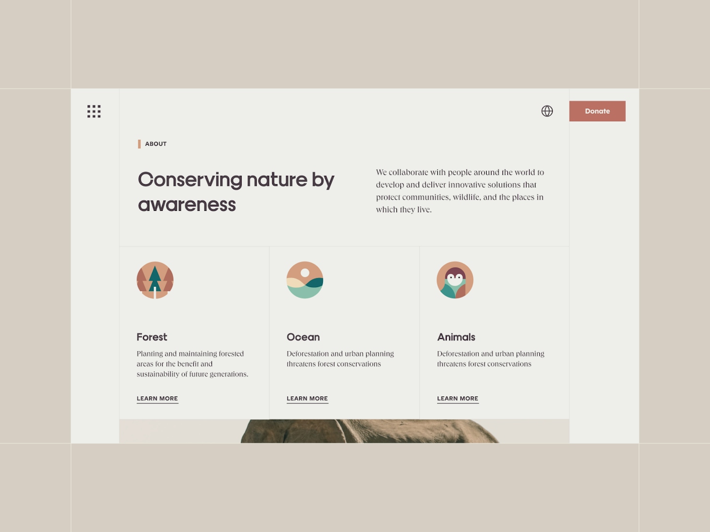
This self-initiated UI/UX project takes a pressing subject and turns it on its head to hopefully capture the hearts and attention of people who haven't been thinking about the climate crisis. We wanted to use a welcoming and approachable aesthetic to convey an important message that both adults and children can feel included without the doom and gloom.
Painted according to nature
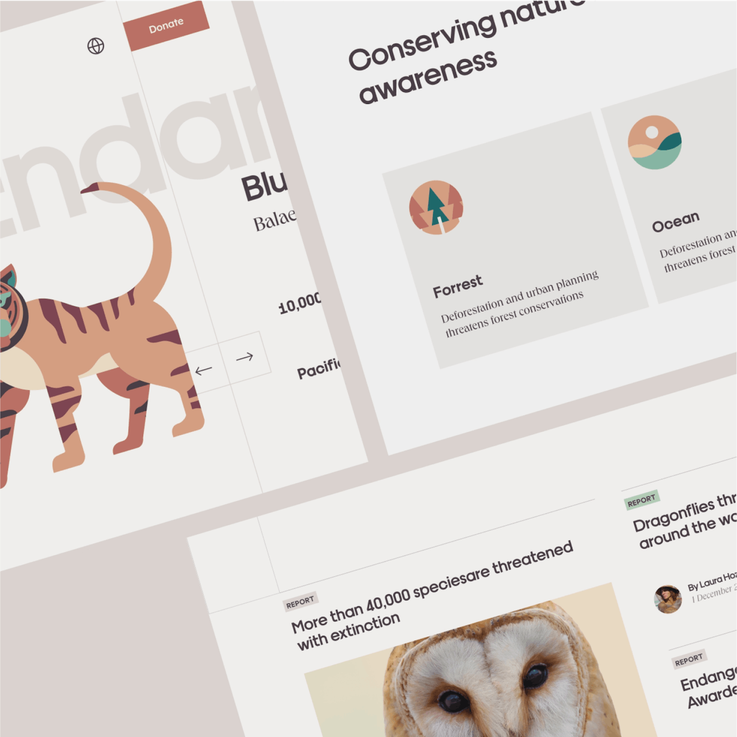
Inspired by the rainforest, the colour palette is mostly made of deep and rich tones - emeralds, chocolates, and burnt oranges. This palette makes it really versatile to adapt to the different animal species whether land or sea and it's highly adaptable to other topics surrounding the climate crisis.
.

Hook them in with design. Reel them in with facts.
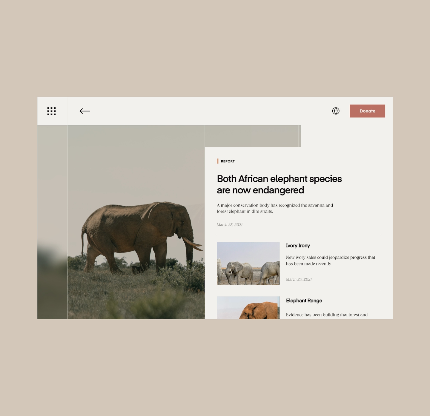
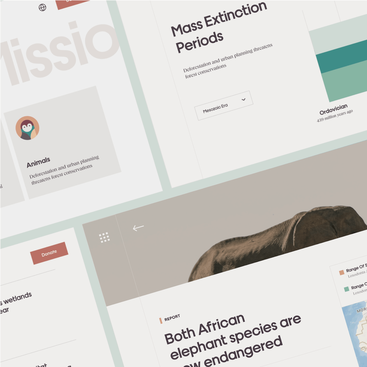
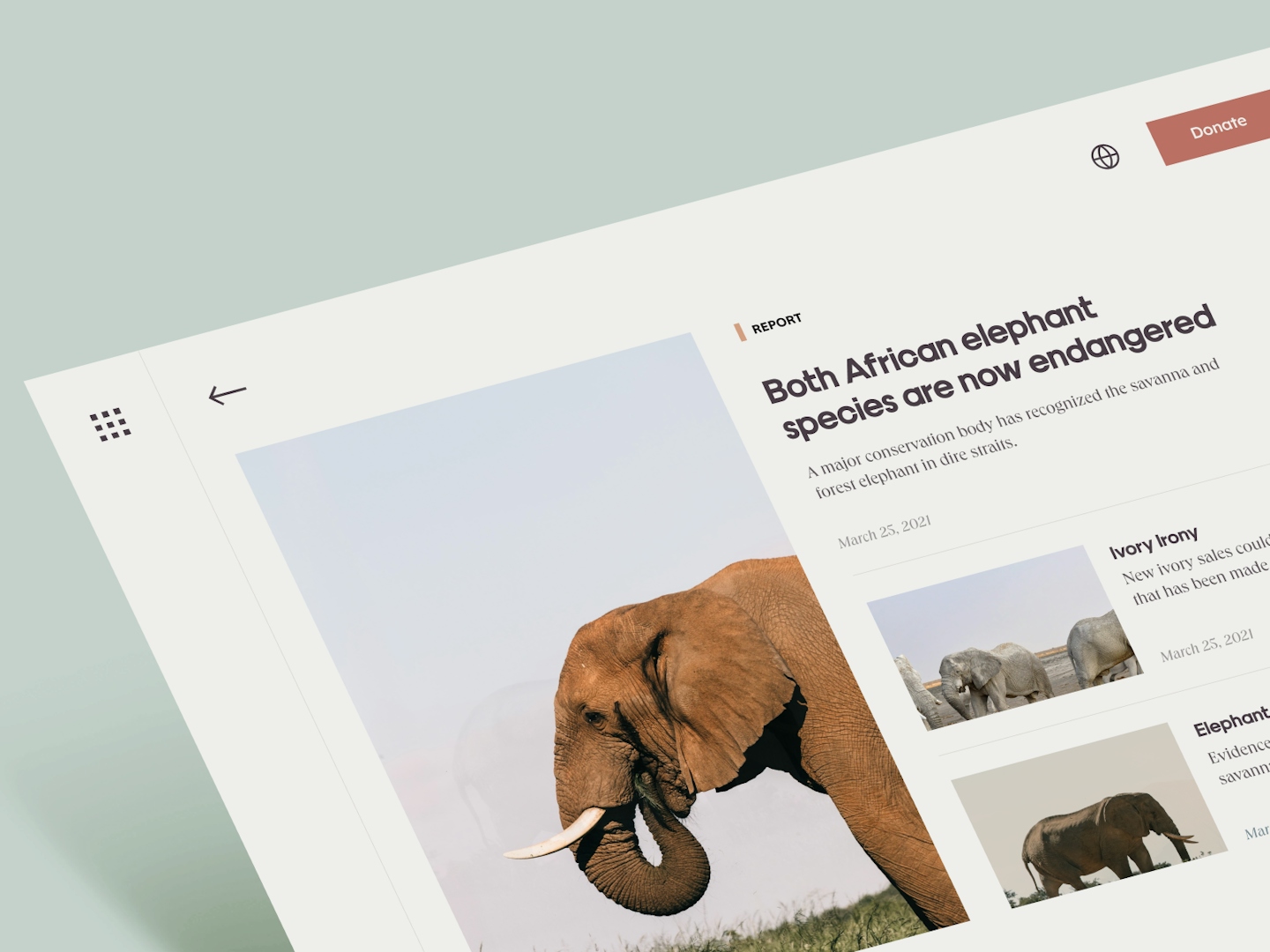
Parallax is the backbone of this project - the foundation we build most of the design elements on. From the animals' transitions to the article pages, parallax provides a sense of depth and immersion in the most straightforward way.
The use of geometric shapes simplifies the illustrations while the interactions are the hero to this microsite. The parallax brings the animals to life and adds a 3D effect while the overall layout remains clean and digestible. The key here is not to overwhelm but to inspire more effective conversation. When information is served in a way where the majority finds palatable, it's more likely they'll eat it.
