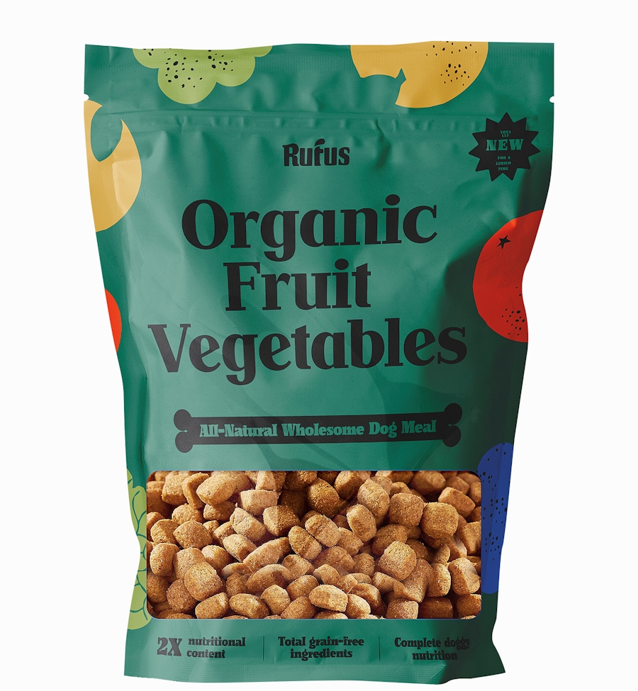
Healthy food for your happy pups
- Year2020 — 2021
- Disciplinebranding, illustration
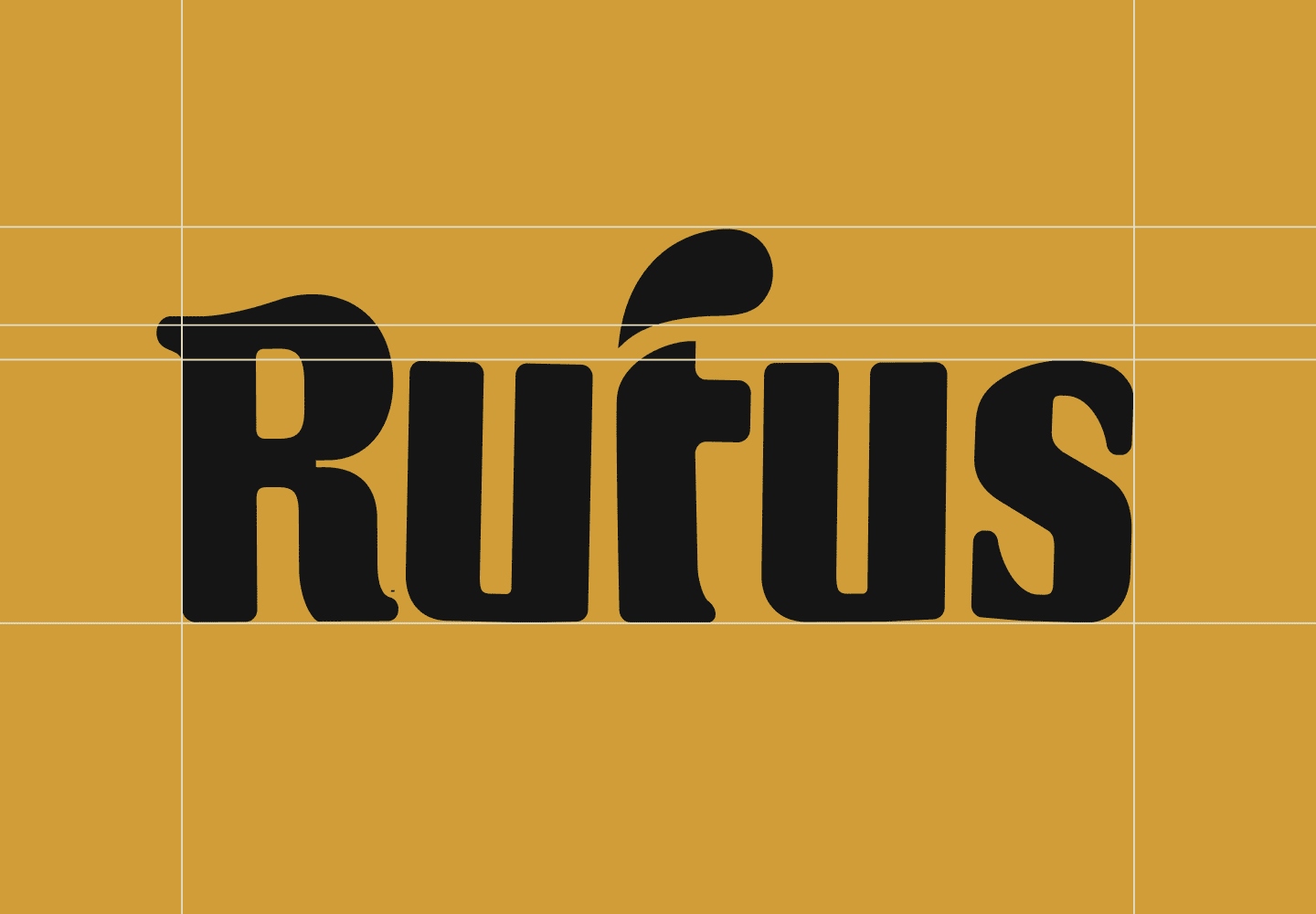

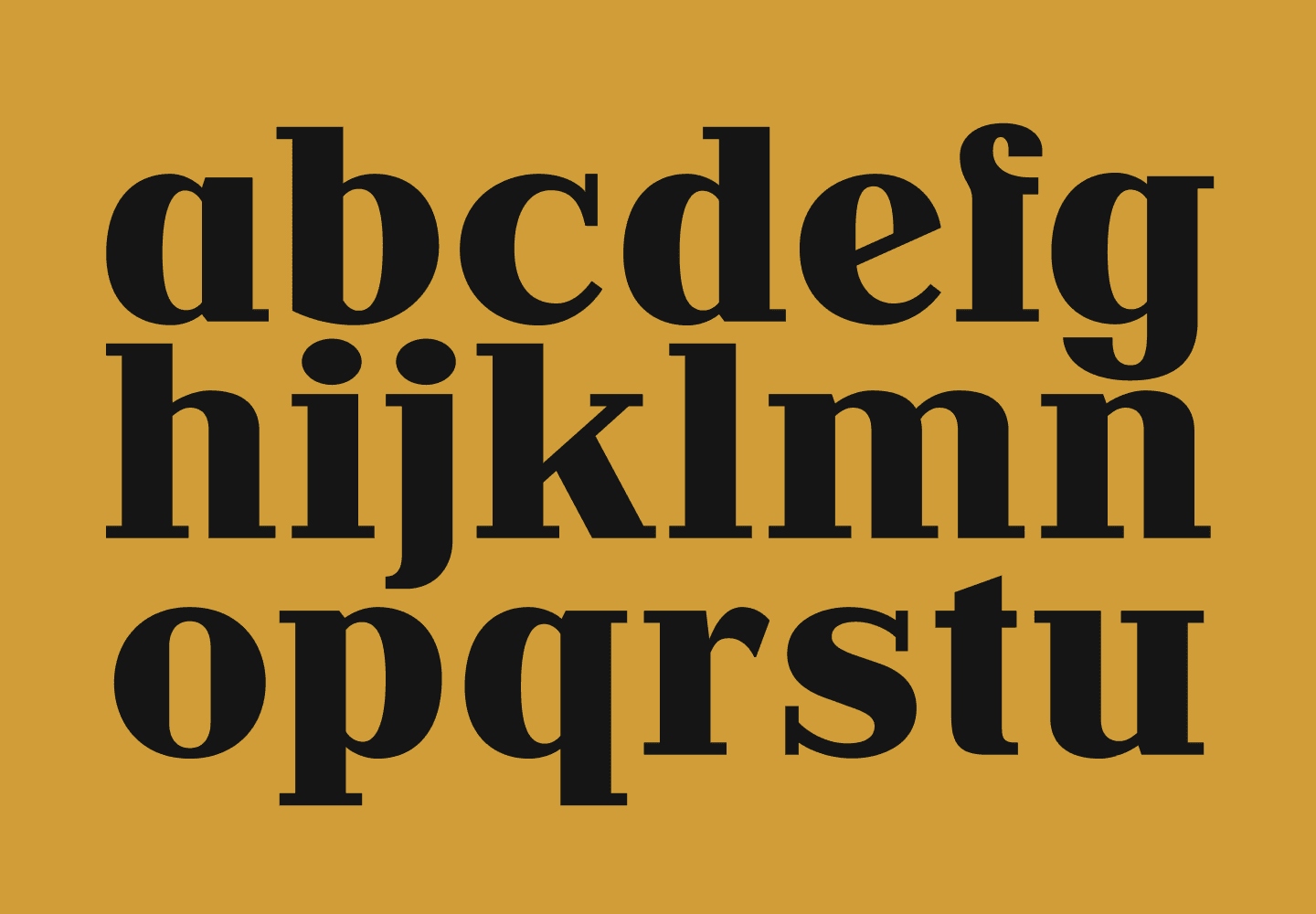
Pet wellness with a 1930s edge
.
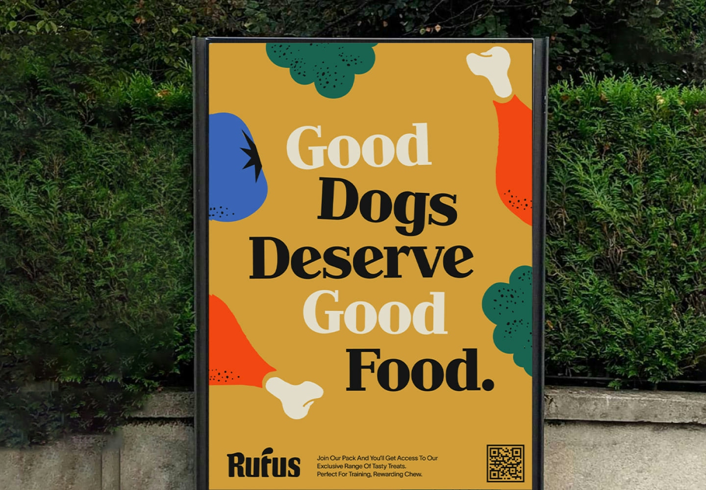
We're a part of the generation where furkids are our life. We treasure them. We love them. And most of all, we spoil them. To us, they deserve the best. Rufus can be viewed as your dog's best friend (besides you) that's serving food he believes other dogs like him will love and benefit from. The overarching identity is down-to-earth, modern, yet fun - taking inspiration from vintage cereal boxes but reimagined for a pet wellness brand.

.
.
.
Strong character, gentle soul
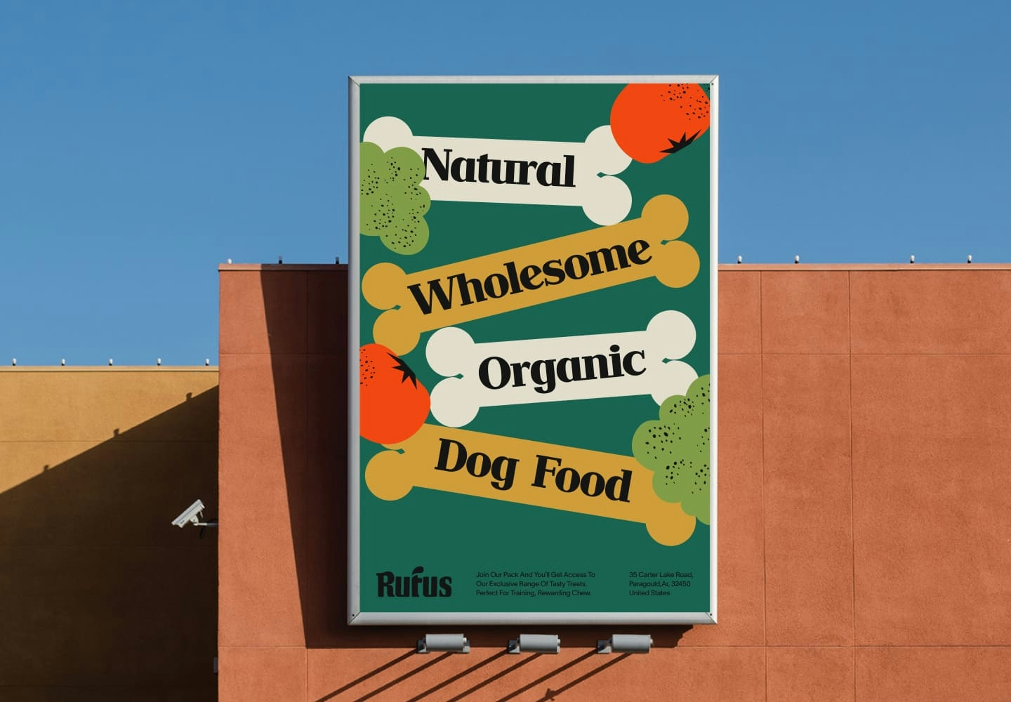
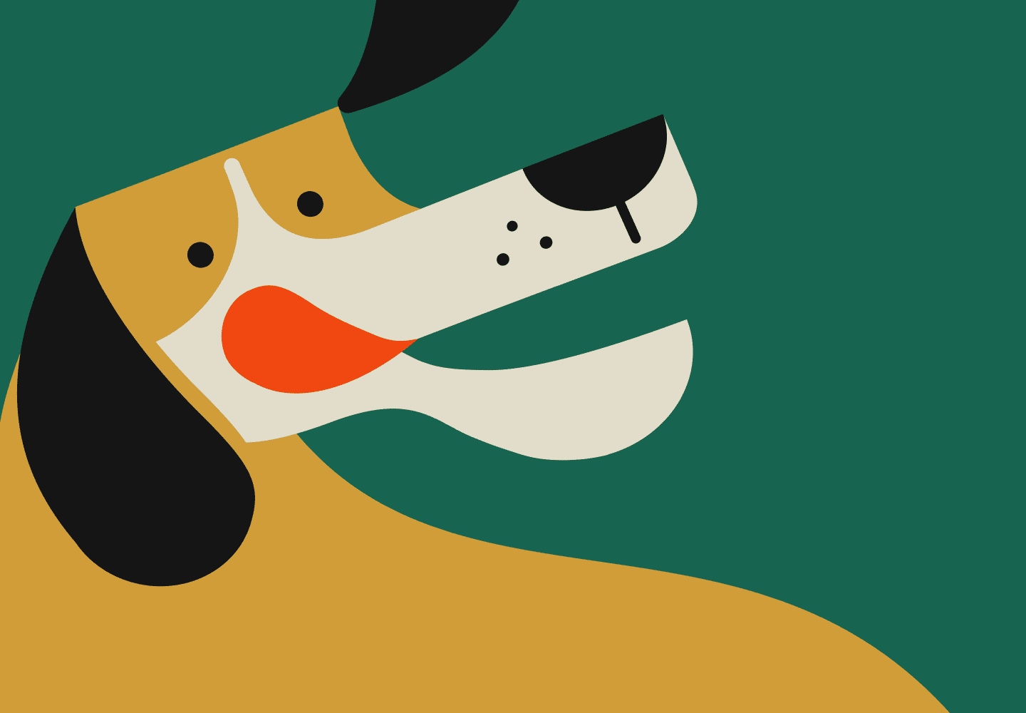
The identity as a whole stems from balancing between organic and geometric. We wanted to play with the possibility of creating a look and feel that's loose and fluid but still strong - toeing the line between what it means to be bold yet still soft.
.
.
.
.

Modern design with a vintage twist
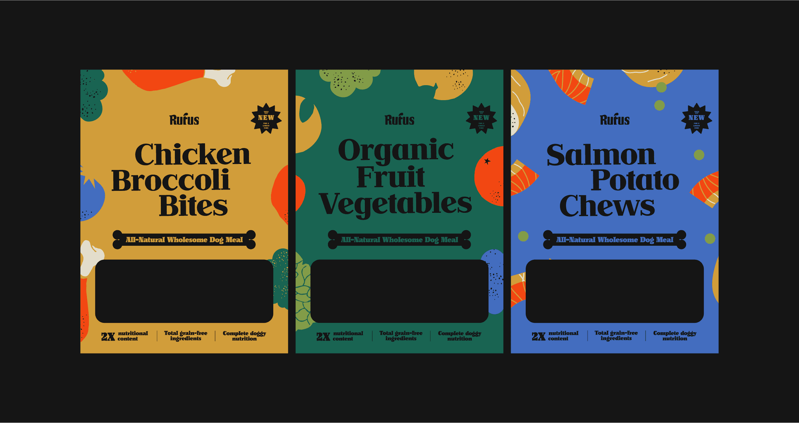
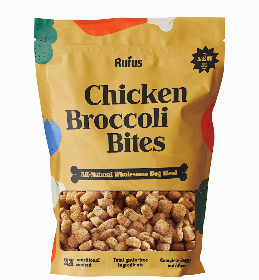
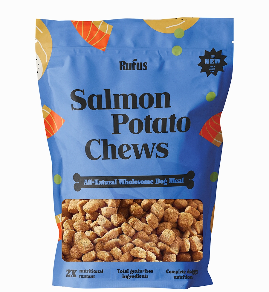
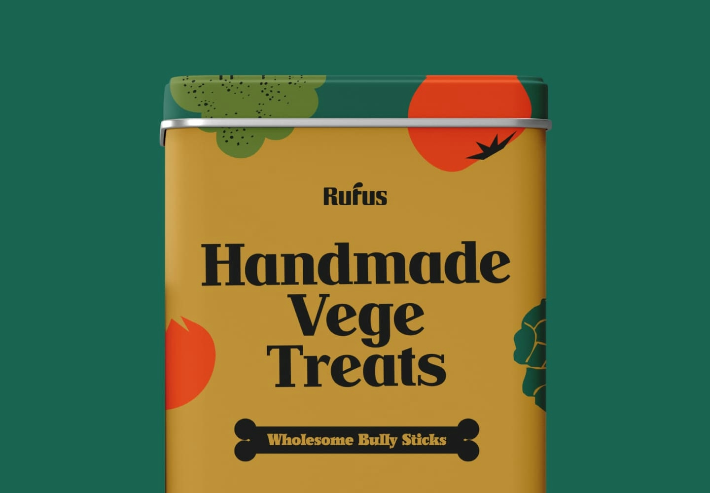
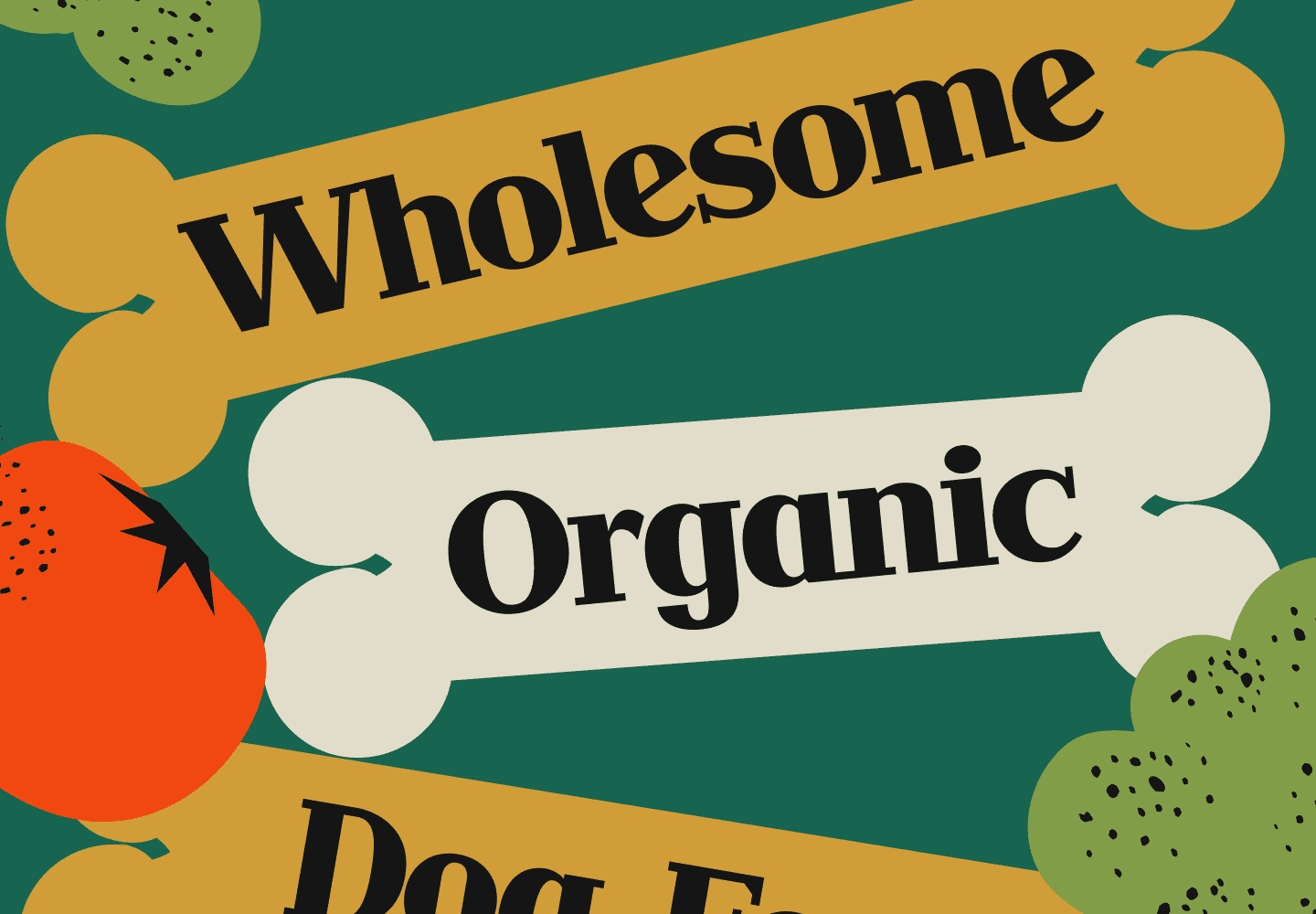
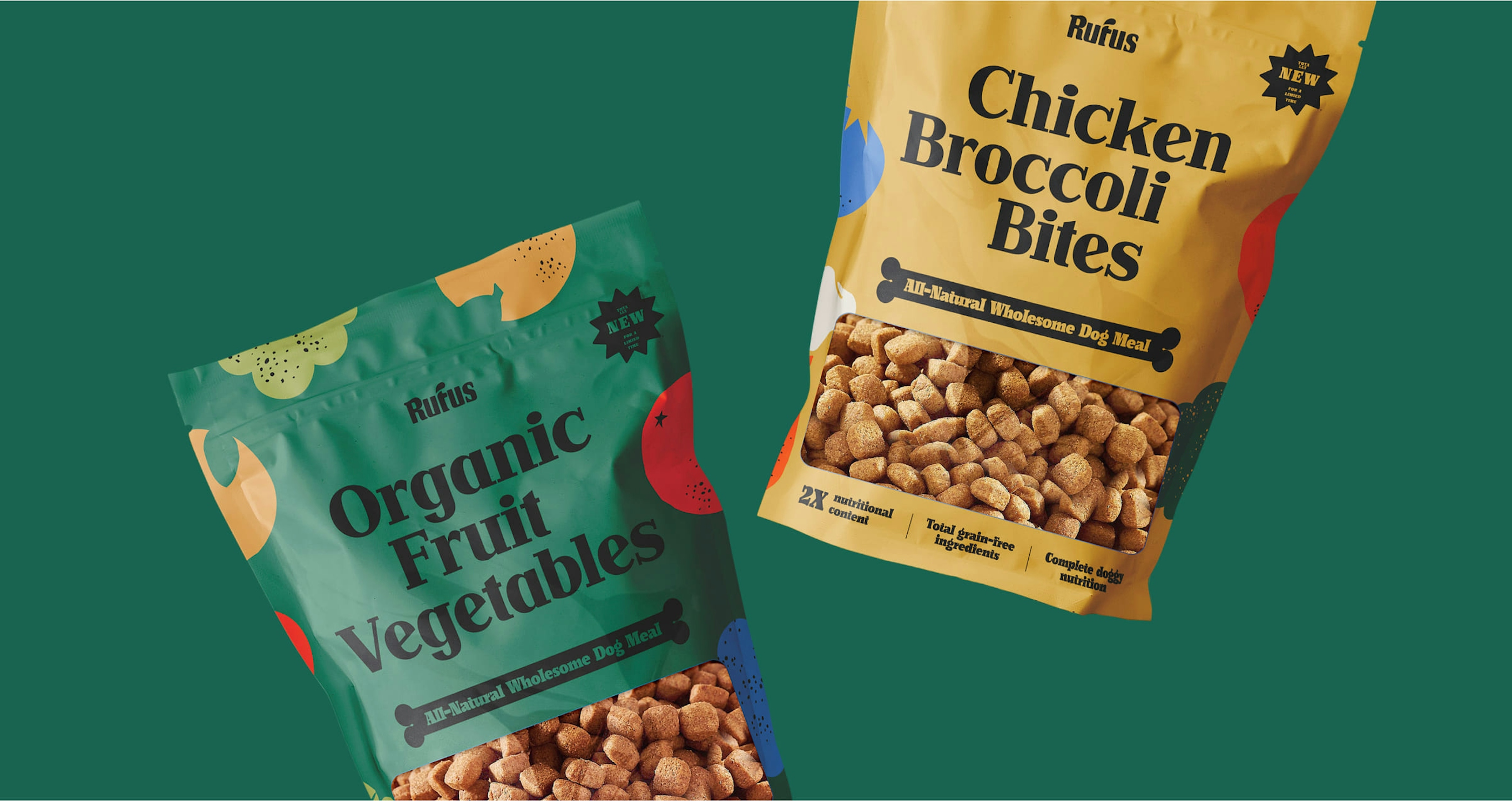
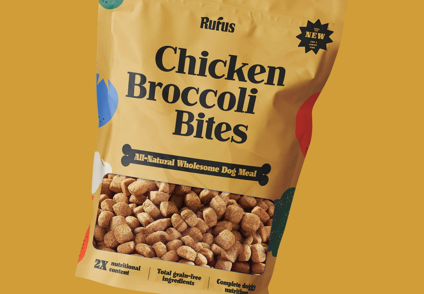
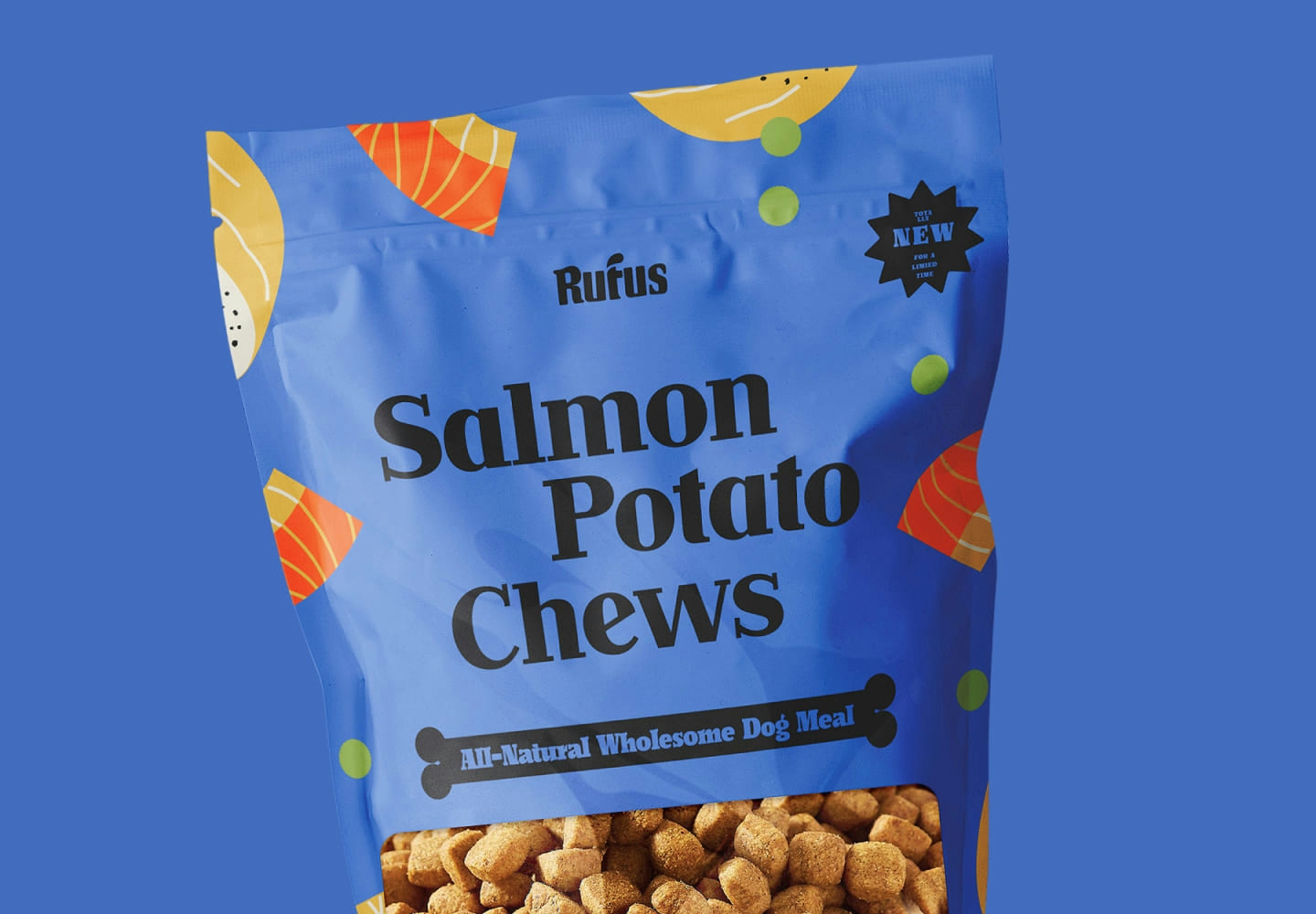
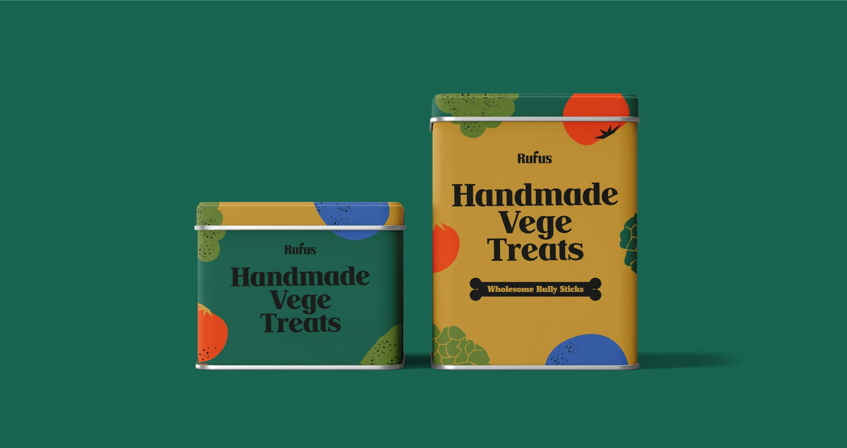
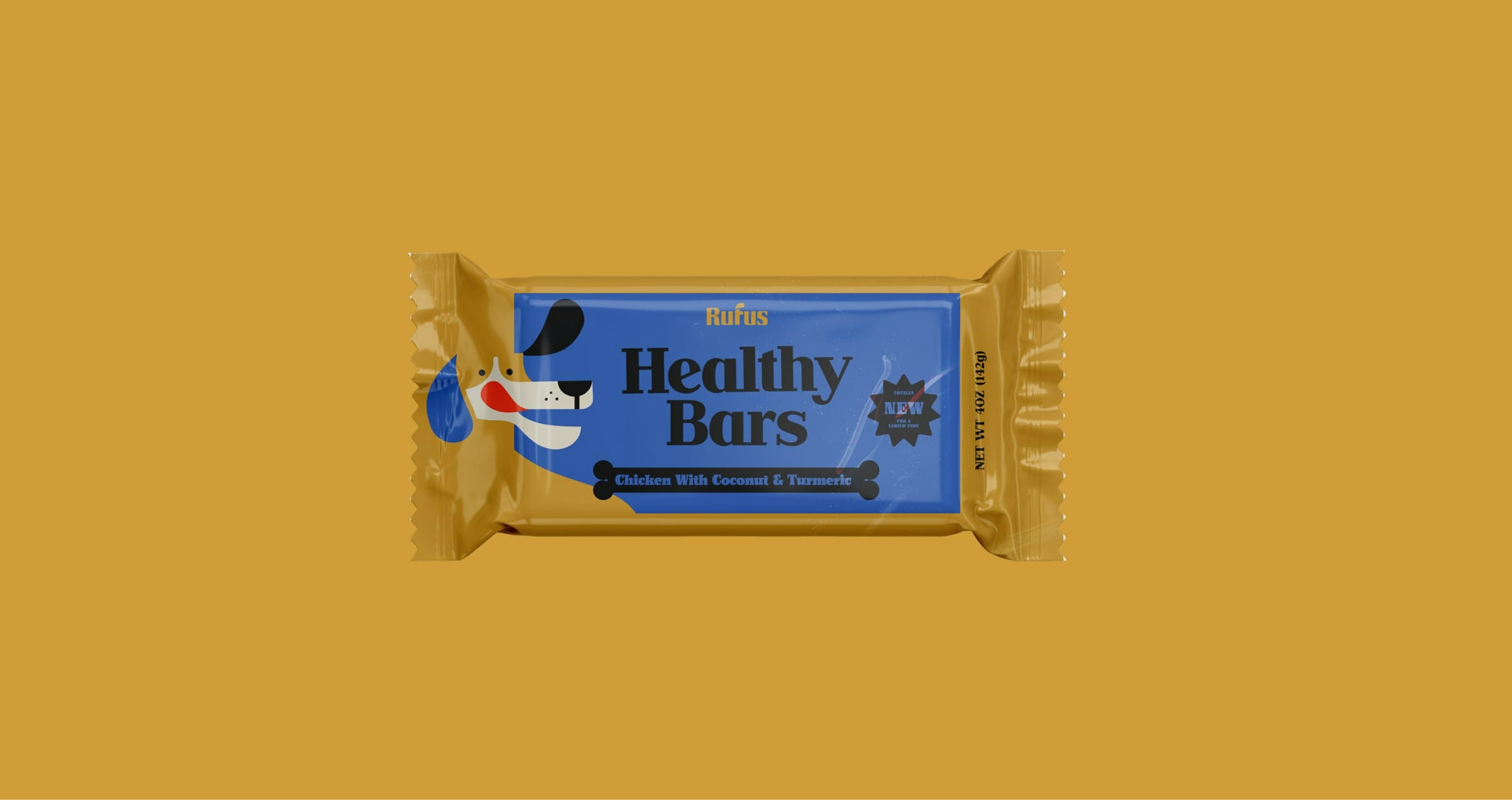
Rufus' packaging can be simply described as minimal and modern with a vintage twist. We wanted to create something that would look good lying around in your home (in tact or shredded on the floor). We used loosely hand-drawn ingredients to convey the organic aspect of the brand.
.
.
.
Teaching old colours new tricks
Rufus' colour palette continues in the same 1930s vibe but injected with the energy of a boisterous puppy. We paired mustards and dusty creams with earthy greens, blues, and oranges to create enough contrast to exude playfulness without skewing away from the vintage look & feel.
.
.
.
.

