The bomb dot com for burgers
- Year2021 — 2022
- Disciplinebranding, web, print
Celebrating burgers, front and center
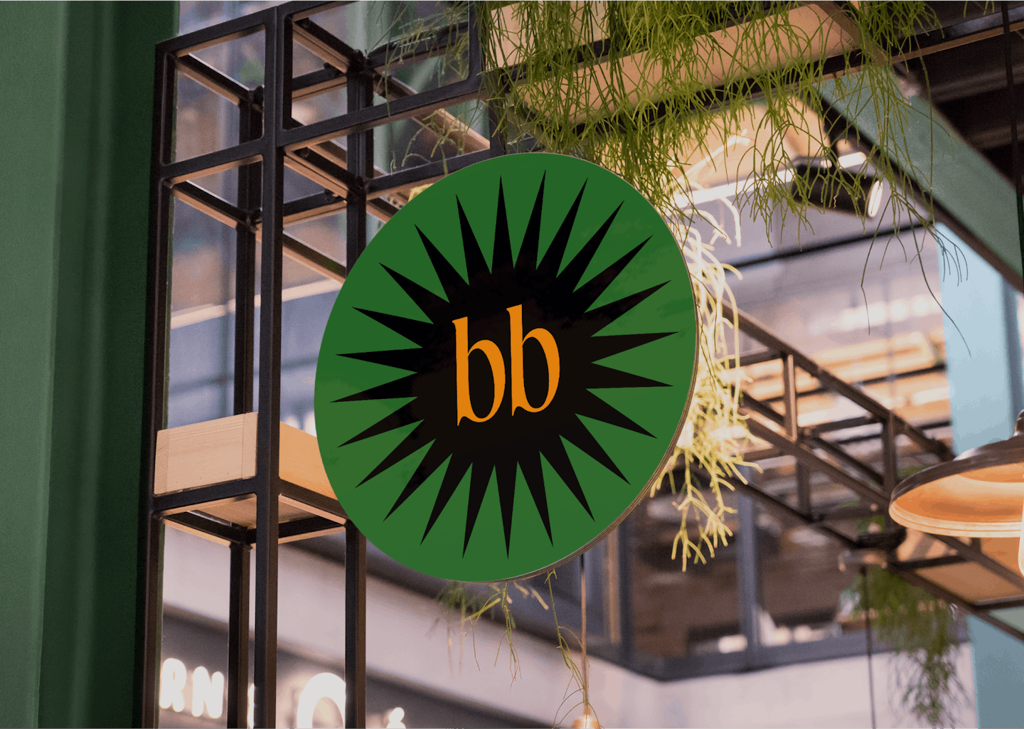
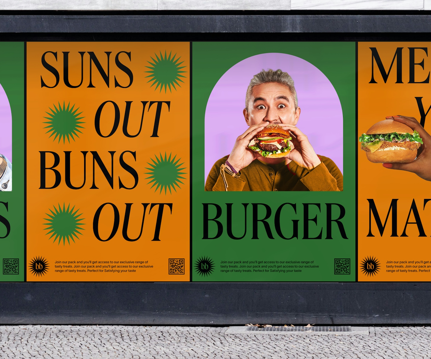
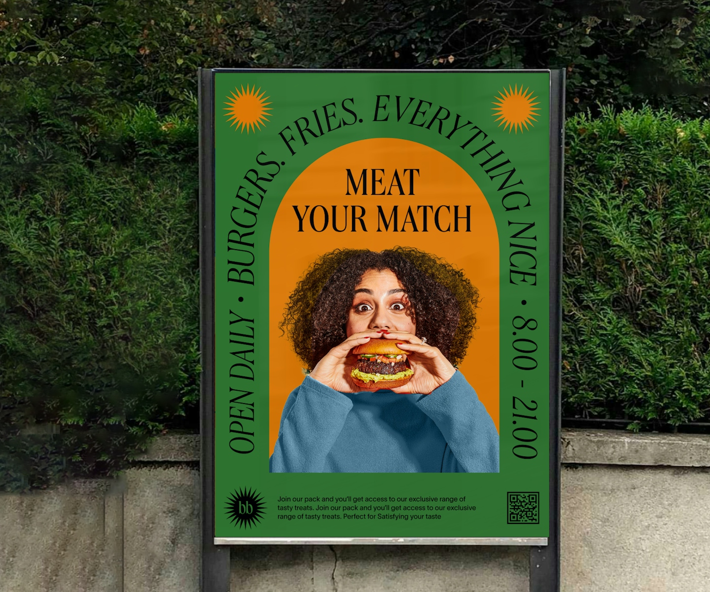
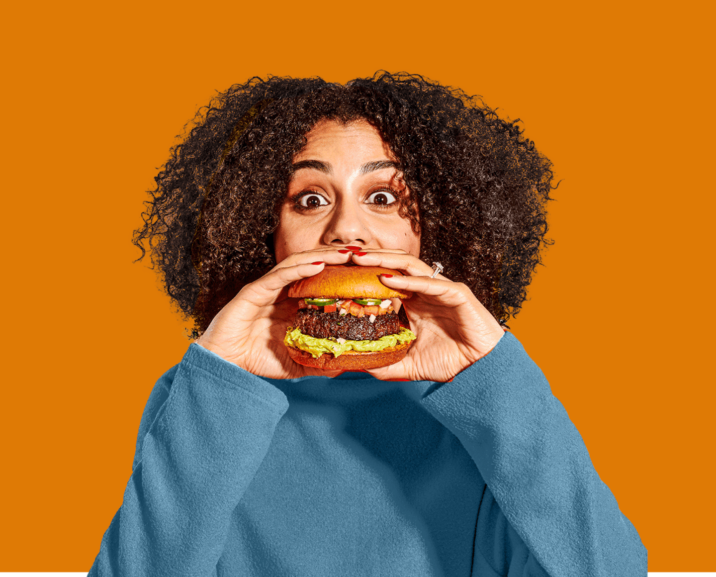
Burger Bomb was designed for the love of burgers – celebrating its curves and swerves with a juicy brand and website design. The design is inspired by flavourful burgers and we wanted to capture the bursting emotions when you first bite into a really, really good burger.
Juicy burgers with equally juicy aesthetic
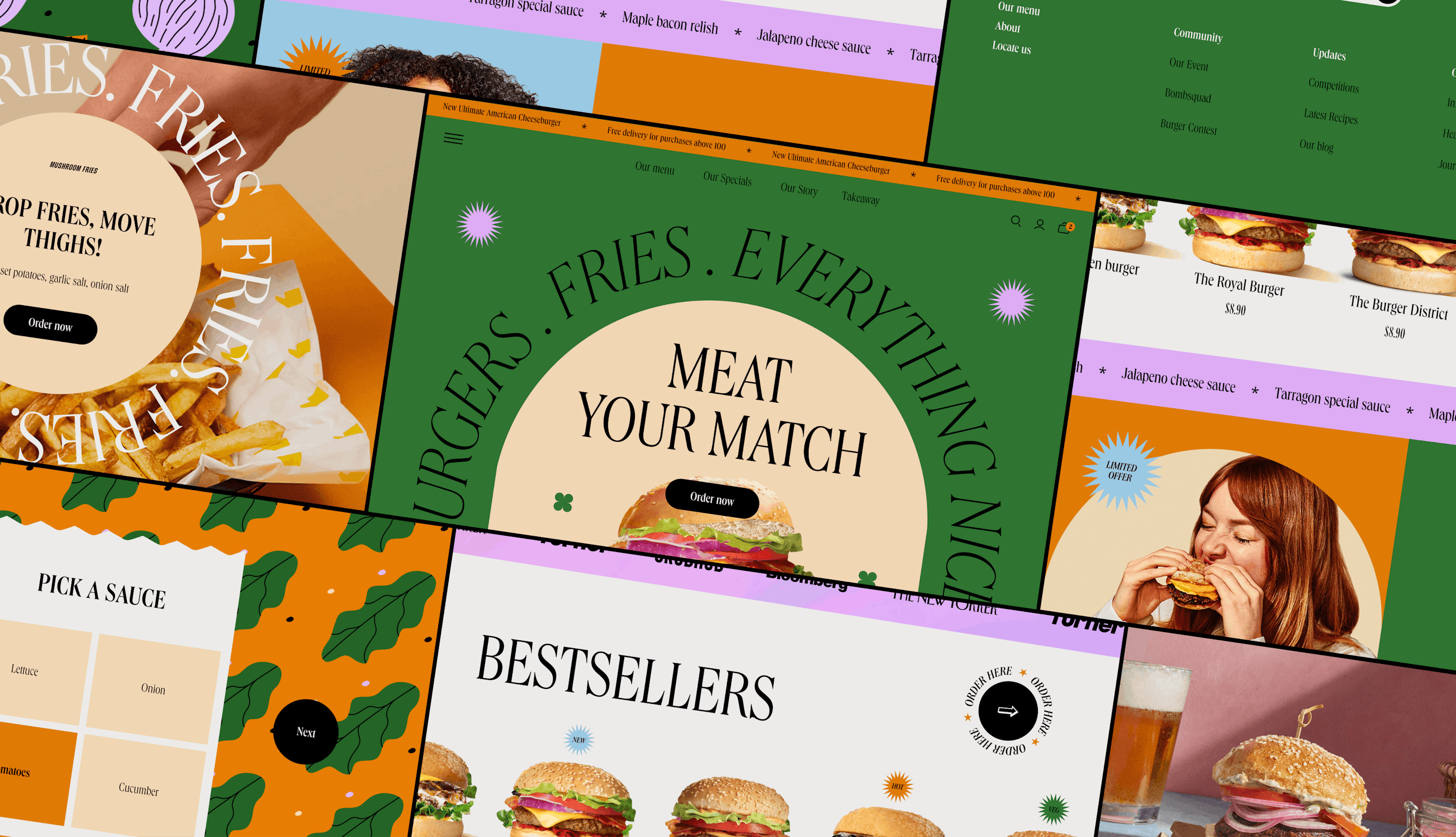
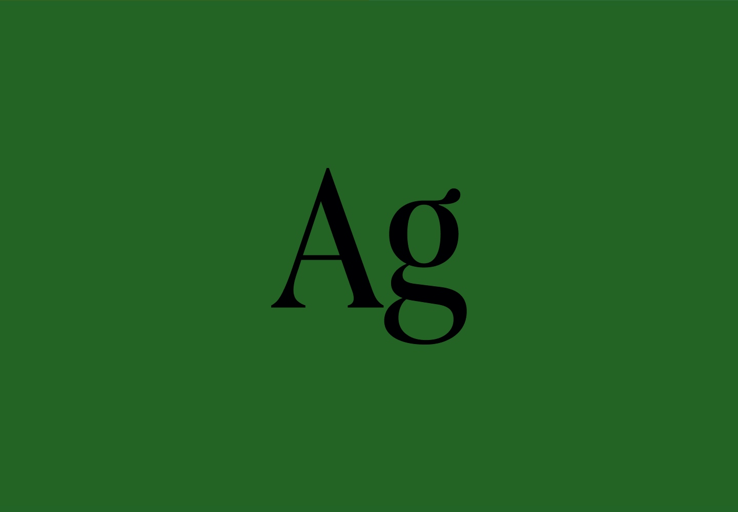
Burger Bomb's aesthetic is inspired by the burgers itself. The curved shapes represent the burger buns and the big typography represents a burger's personality: bold and unabashed. It is unmistakably lively and makes you excited to have a burger. While the website is bombastic and colourful, it is still restrained - we want people to still come for the burgers and stay for the burgers, but have an enjoyable experience while they're at it. That's our goal for the website design.
.
Lettuce, onion, cheddar, it doesn't get any better
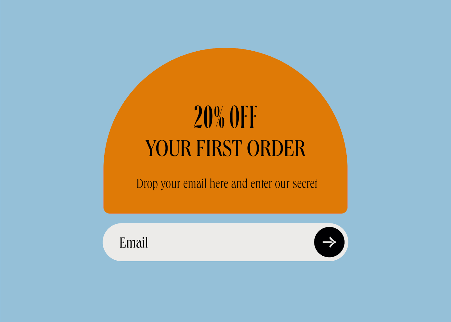
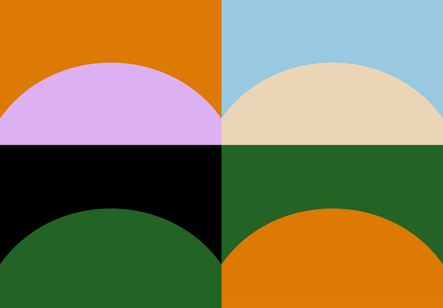
The holy trinity of a burger's backbone: lettuce, onion, and cheddar - the main inspiration behind our colour palette. The colours take on the spirit of a burger but with a little skewed hue for that extra edge. It's pairing the oddest shade of brown with a bubblegum pink that describes how sometimes a pineapple works with ham. It's weird but it flies off the grill.
.

.
.
If you can dream it, you can build it
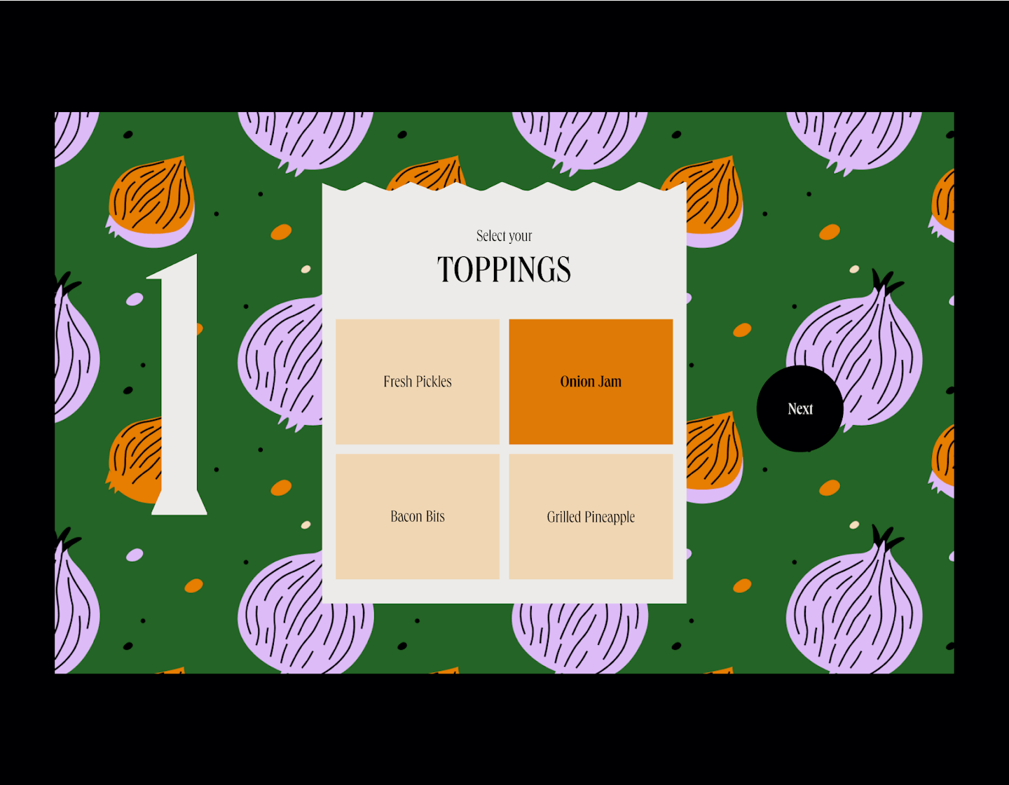
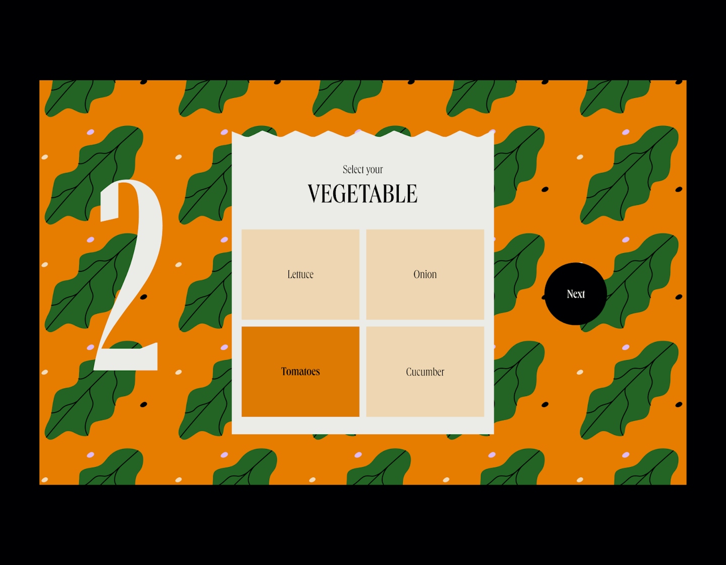
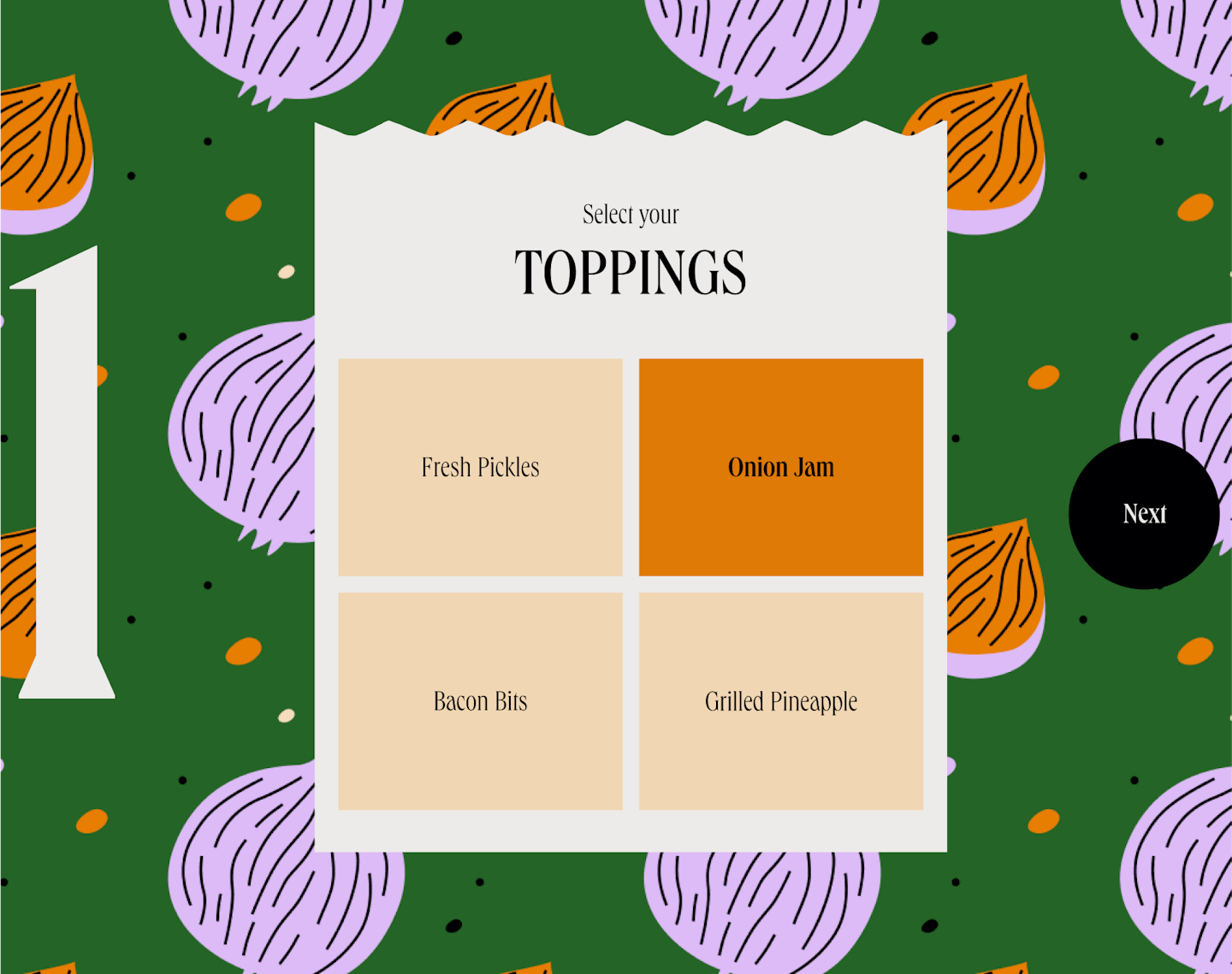
Imagine if you could customize and build your own burger effortlessly from wherever you are while potating at home - wouldn't that be the ultimate burger fantasy? We wanted to make that happen with this Build Your Own Burger section while also creating opportunities for the brand's personality to shine through flashy illustrations. It's a fun page but also highly functional.
.
