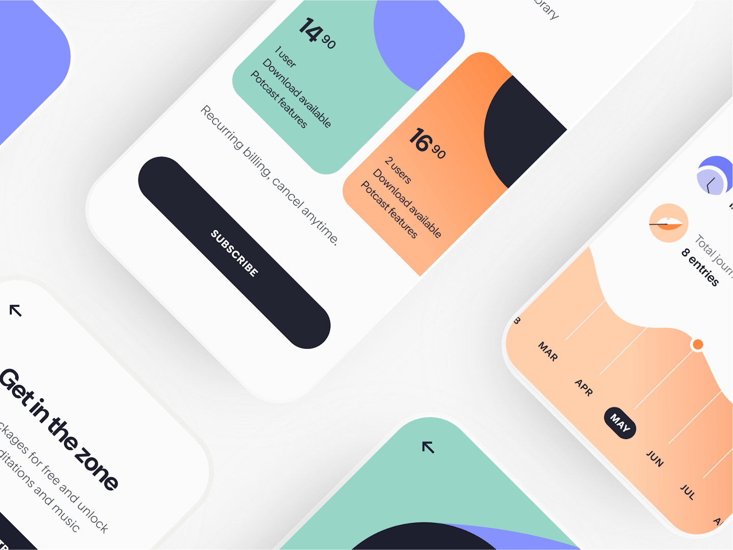
Calm that follows you wherever you go
- Year2021 — 2022
- Disciplineuiux, illustration
- SectorHealthcare
Relevant concept with an updated design
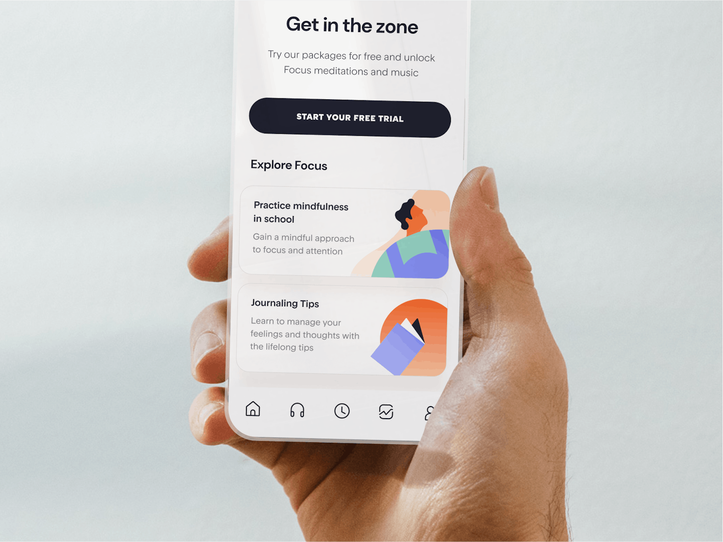
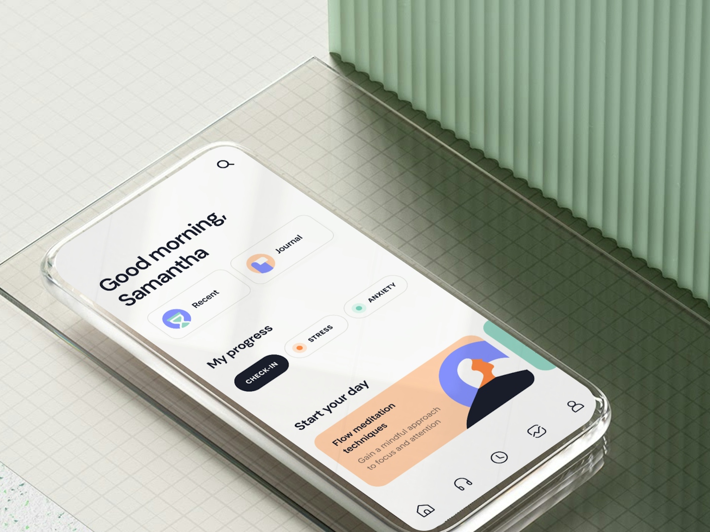
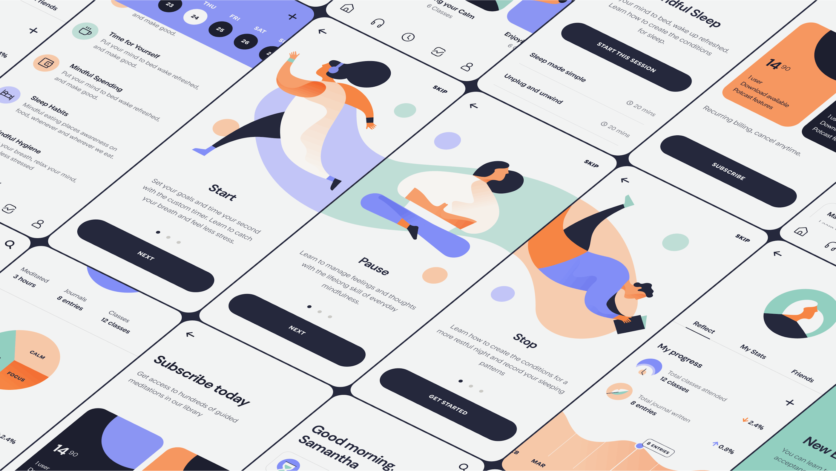
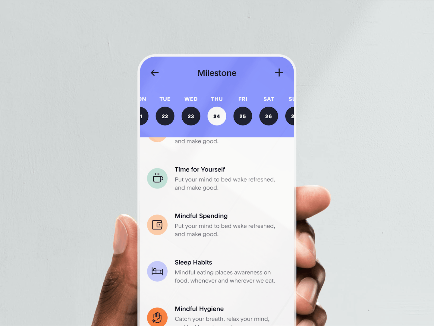
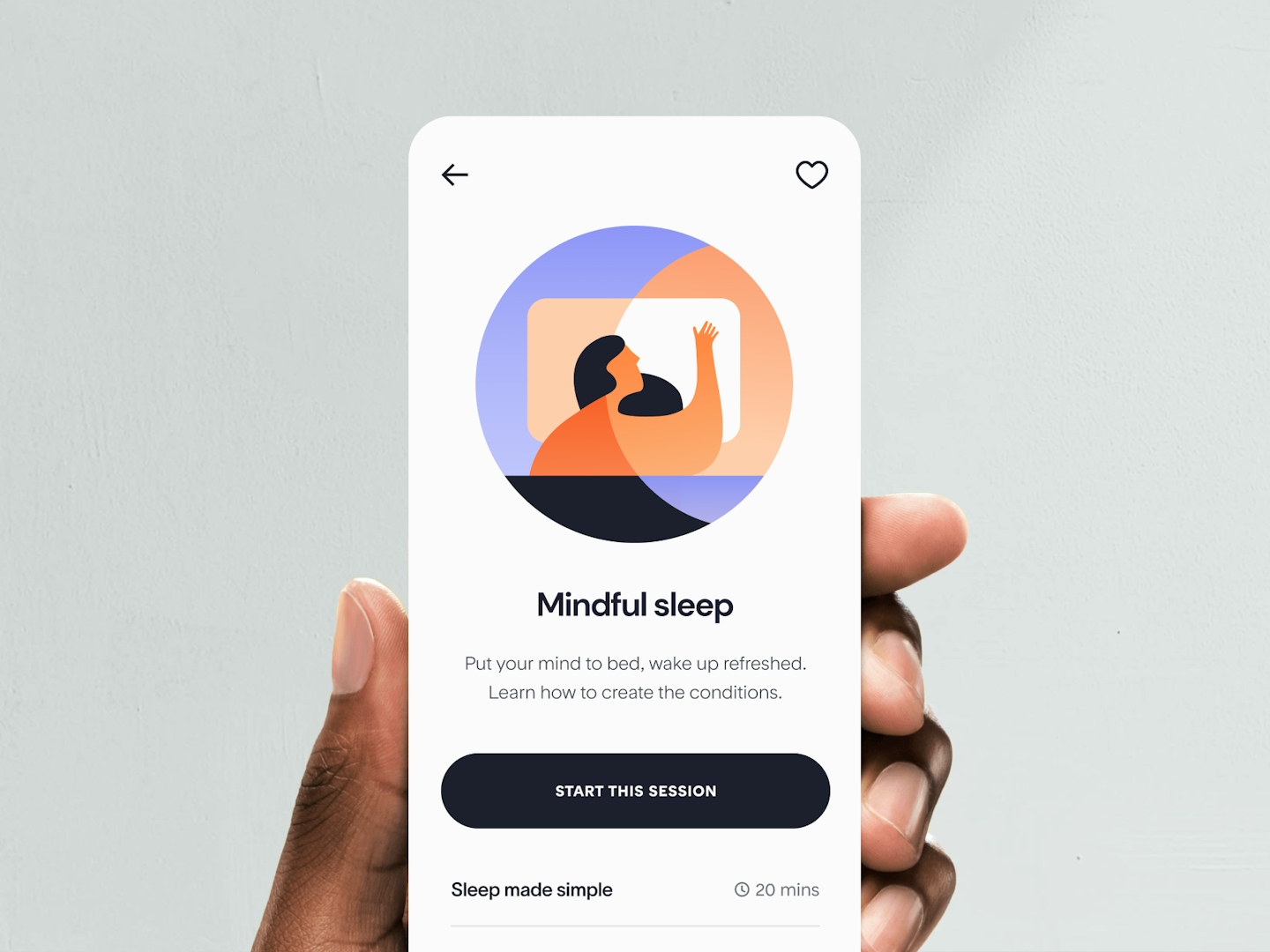
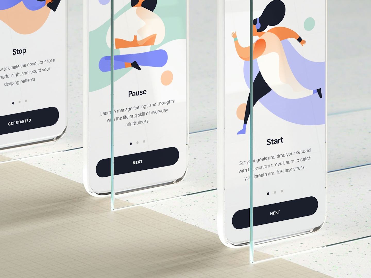
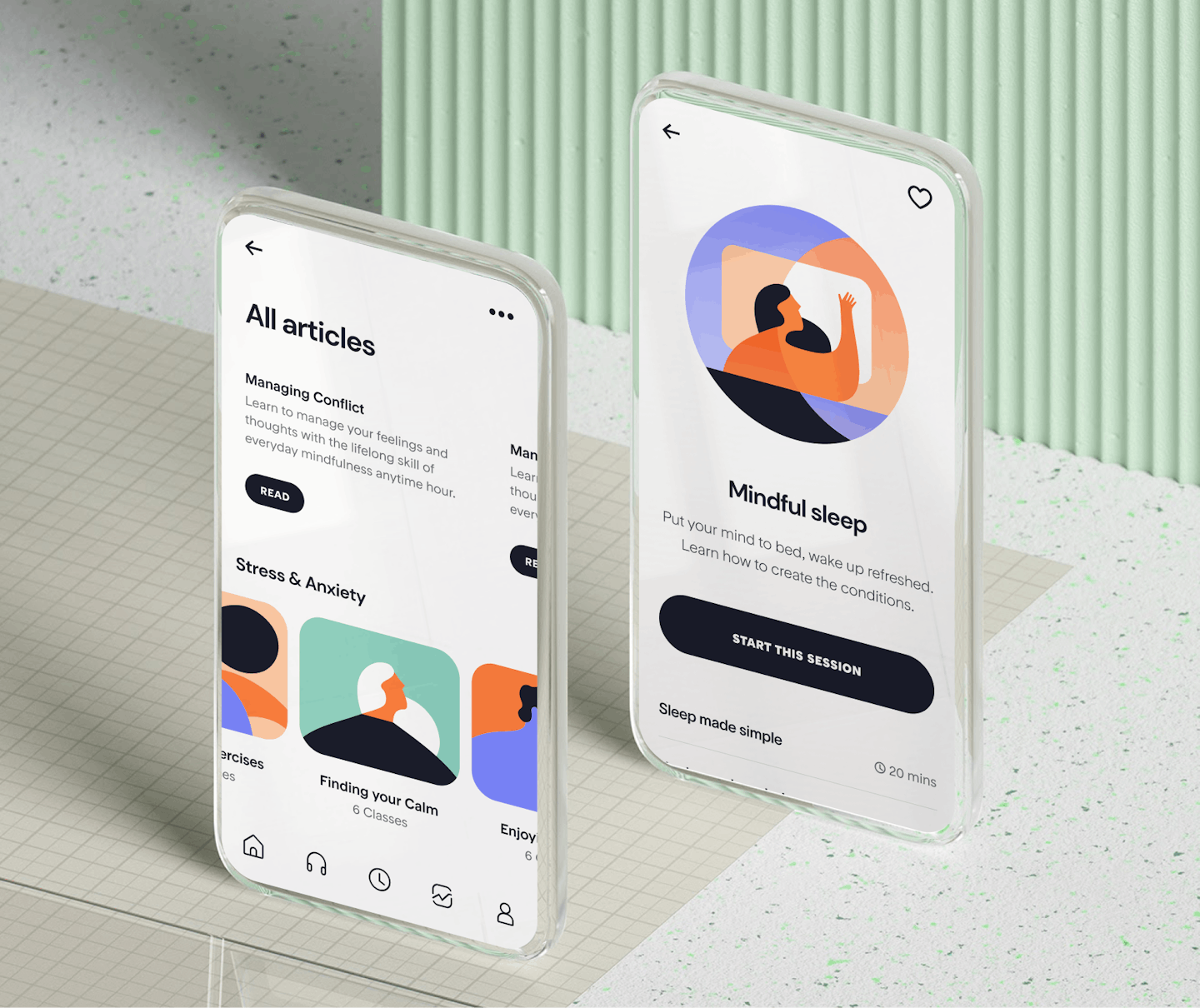
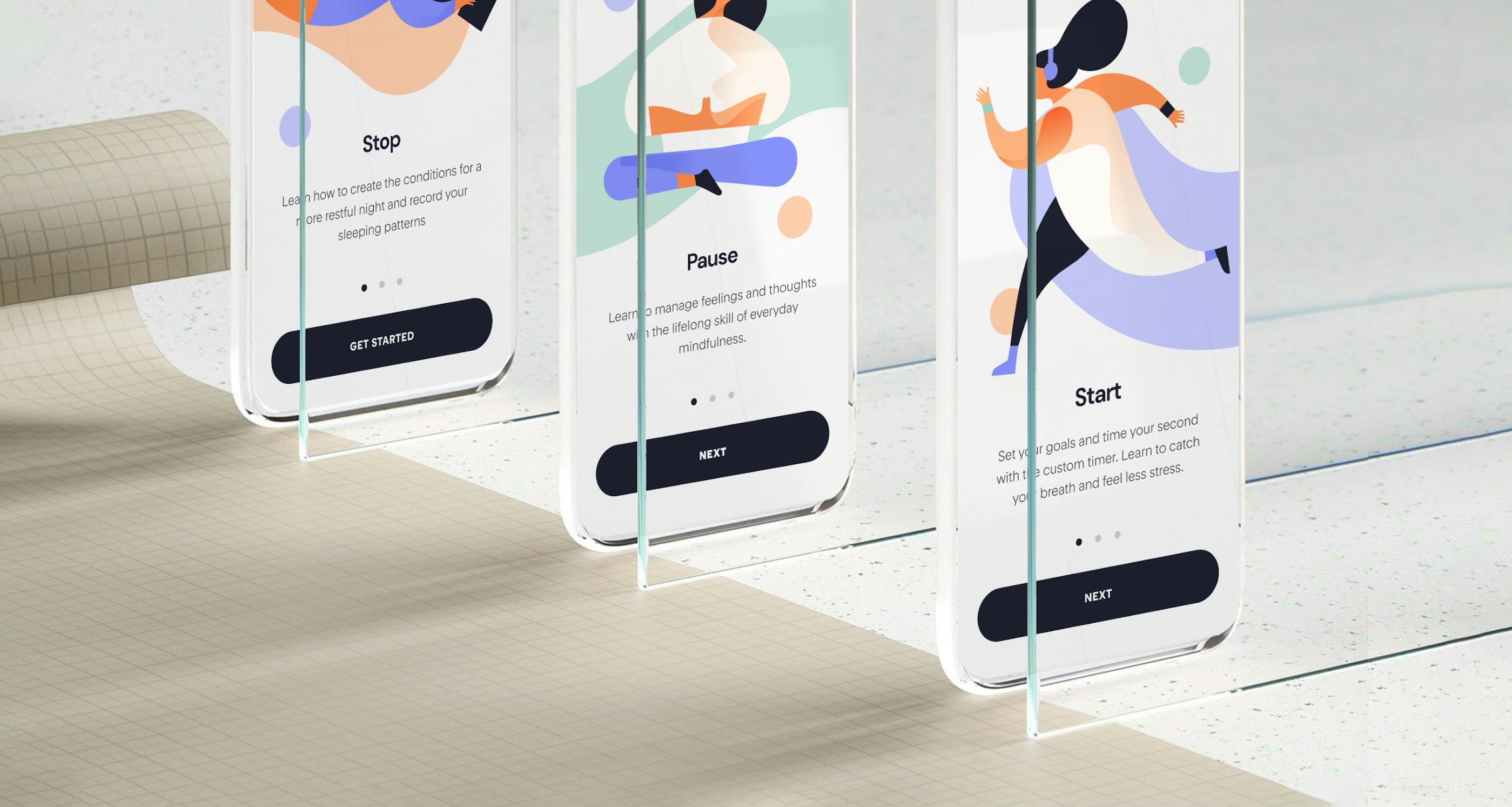
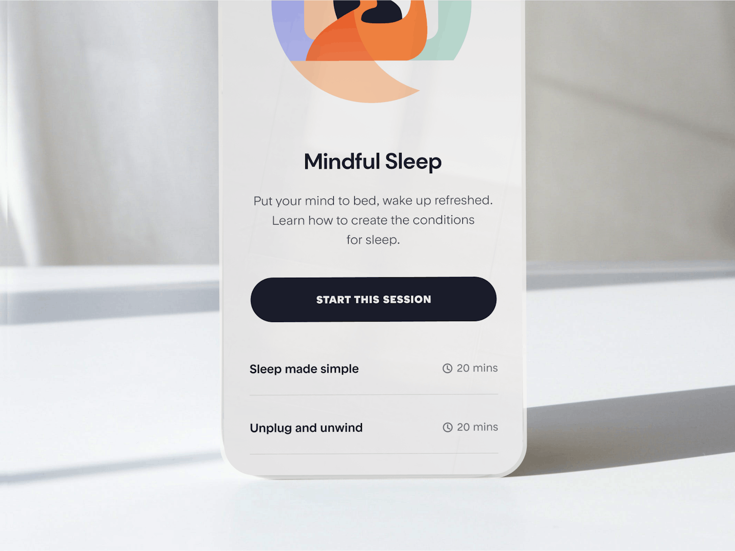
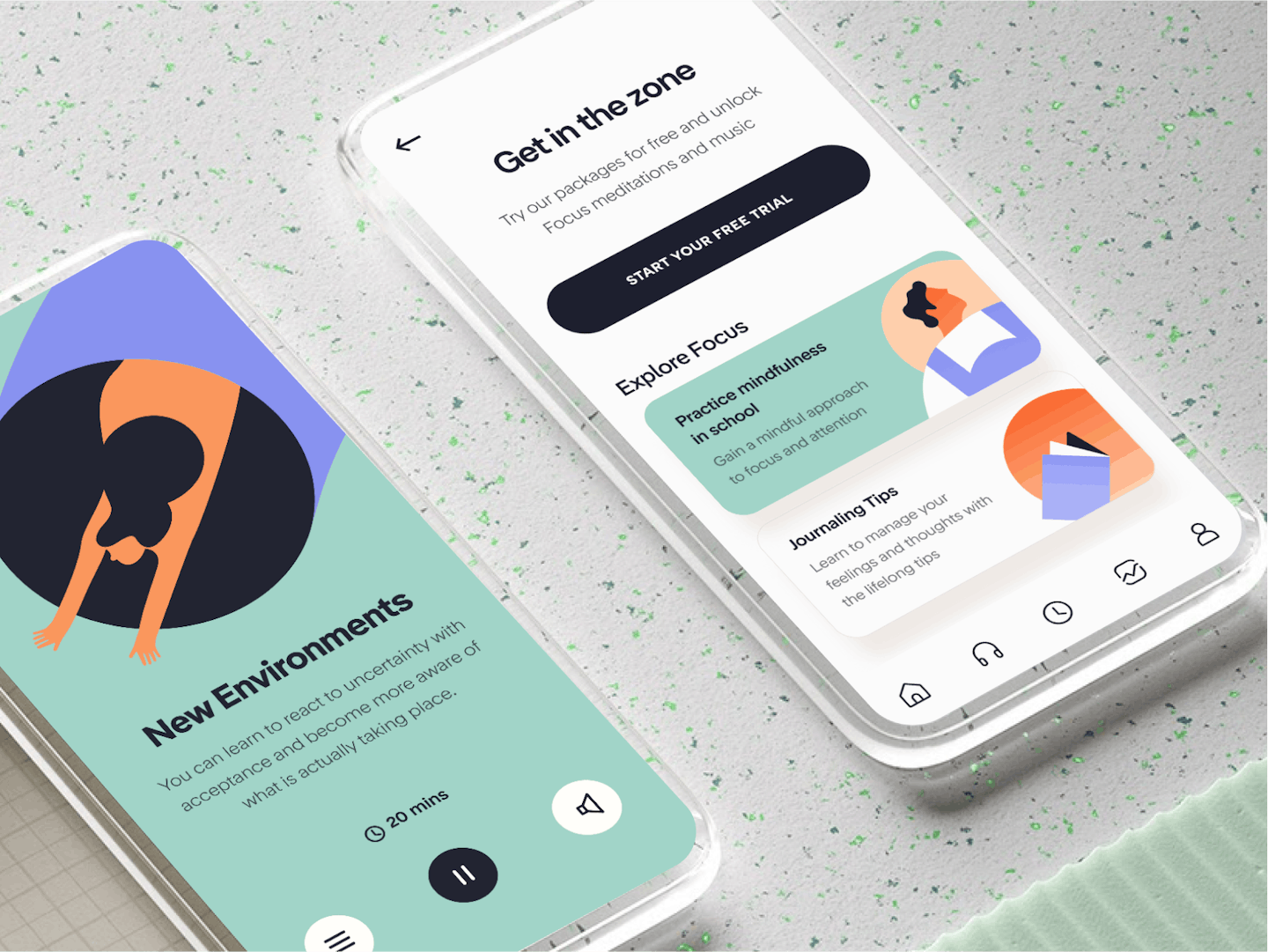
The Mindfulness App was one of our first popular design when we first posted it on Behance. Somehow, people were really taken by the simple and calming design and we've been asked to replicate it numerous times. We still love the concept and it still is relevant until this day but the design no longer represents where we are today so we decided to give it an update.
Spreading universal peace
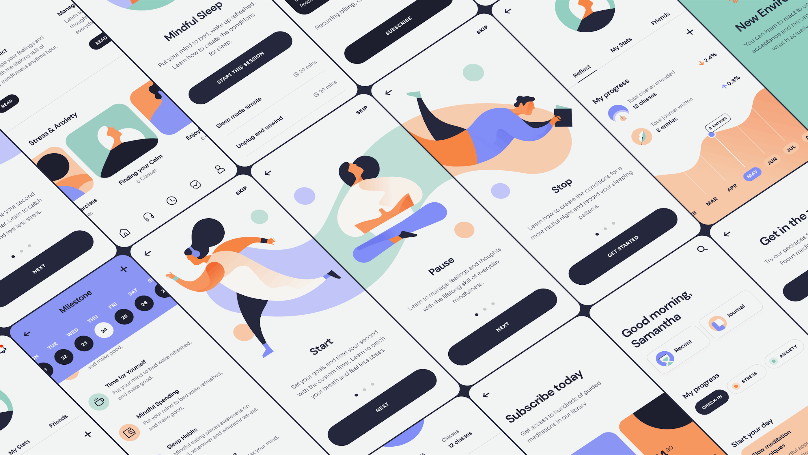
Our previous colours for The Mindfulness App leaned heavily on the female gaze - the app, overall, felt too feminine and non-inclusive. Today, we updated it with a set of colours that remind us of nature; whether it's the sea, sun, and sky or day, night, and dusk, these colours exude a sense of tranquility without alluding to any one gender or person.
.
.

