Space exploration in the webspace
- Year2022
- Disciplineweb, interaction
A site made for new frontiers
When you think of NASA, you think of a giant leap for mankind - going where nobody has ever gone. But when we came across their website, we felt it didn't do justice to the amount of innovation and frontier-busting they're doing. It lacked access to information and education to the amazing missions they're on and we wanted to see how we could change that.
.
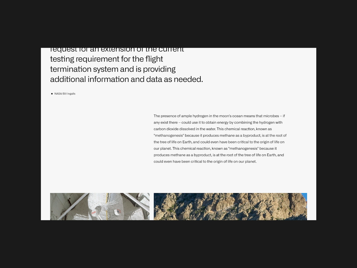
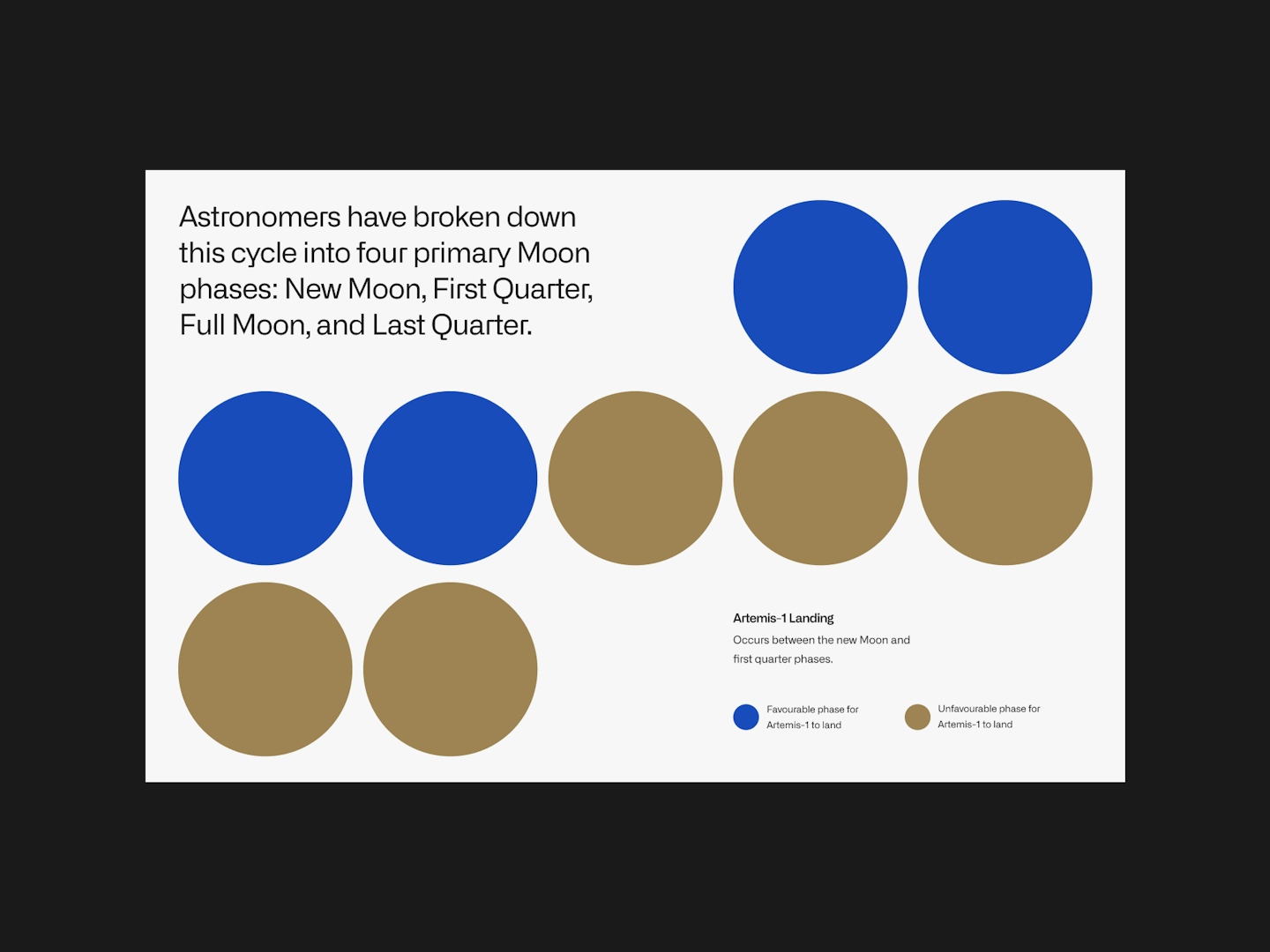
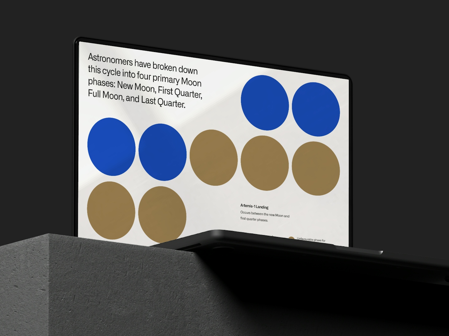
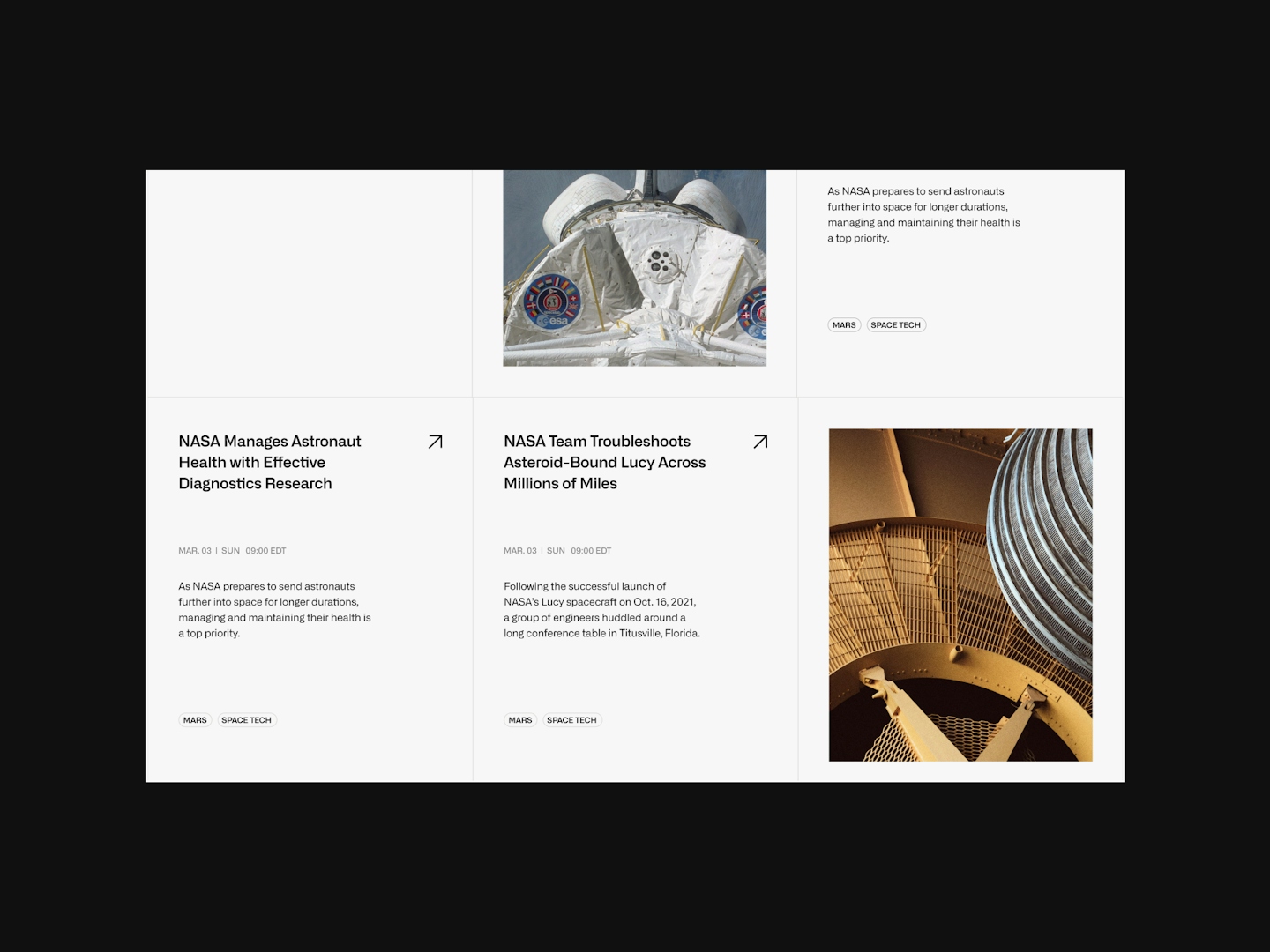
We recognized a lot of untapped potential for NASA and wanted to create an immersive experience for us folks on earth who have a thirst for astronomy. We redesigned the site to feature NASA's gorgeous photos in a huge, almost glassy interface where it's easy to reach and clearly laid out information for all to devour. We matched NASA's forward-thinking association with sleek masking interactions - a simple, effective, and modern way to convey the sense of wander and awe.


.
Retro is the new future
No shade on NASA's current logo but their 1970s worm logo is hard to pass up. It's minimal. It's modern. And it goes well on everything. We've simply tweaked the existing NASA colours to flatter shades that work better digitally and introduced a muted gold to round off the primary tones of blue and red.
.
.
Dive deeply into space
We understand astronomy to hold a certain captivating power and we wanted to ensure the website does just that. Space missions can sometimes be intimidating to learn and we wanted the site to feel accessible and inviting with lots of inspiring visuals. Take Artemis I for example. It's one of the first mission to both the moon and Mars - a true human feat but yet, we only know it as a rocket from where we are. If we could create a space where learning and immersing is as easy as scrolling through an Instagram feed, we believe that would encourage more people to be informed of the many mind-blowing things NASA is doing.

