eCommerce for people and alpacas
- ClientPaka
- Year2021 — 2022
- Disciplinewebsite, interaction

Driven by passion and mission
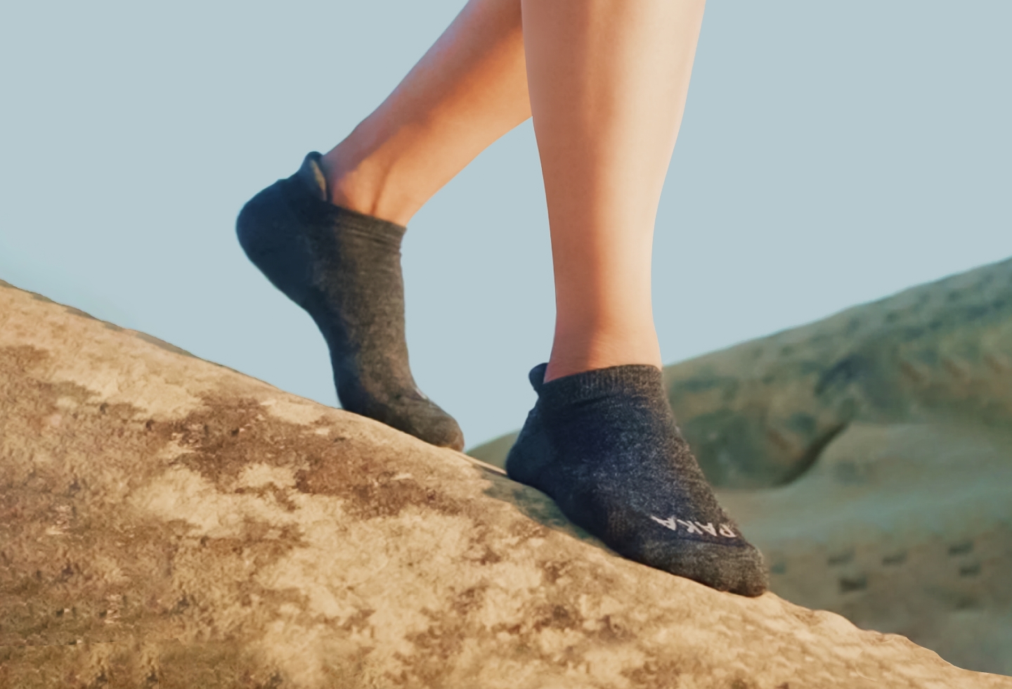
Paka is one of those rare brands who combine functional wear with a deep, genuine responsibility for society and the planet - and mean it. They work with 100+ women in Peru, supporting their craft and helping them keep their Incan traditions alive. To add to that, Paka’s founder, Kris Cody, is hands-on and knee-deep into Paka’s mission; his passion is contagious and we’re so happy to be a part of their journey.
"
Tofu designed Paka's new site, and I can't imagine a better partner to have worked with. They seamlessly integrated into our team to pull off the entire project in less than a month. Daphnie is incredibly responsive and Daniel is a visionary leader in design - he consistently creates, what we like to call, a HSF (holy shit factor). I feel blessed to have found them during this pivotal stage in our brand's story and am excited to continue creating together.
Kris Cody, founder
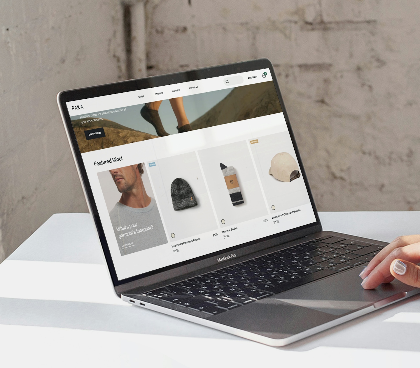
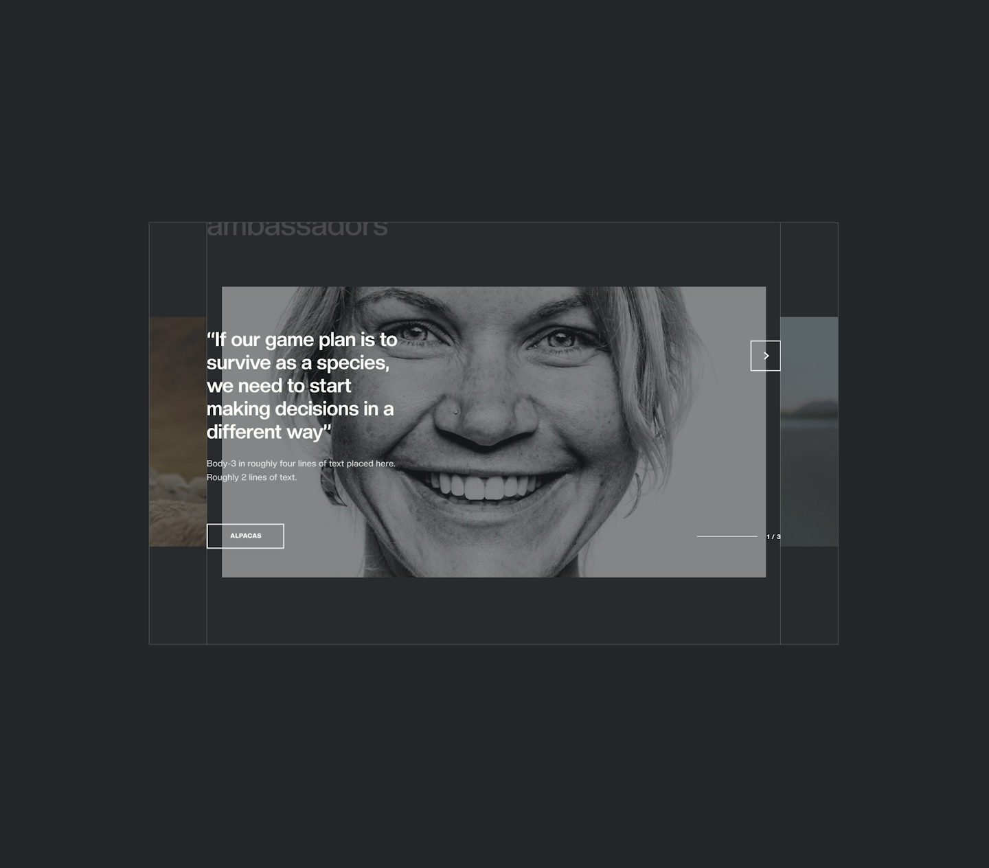
Delightful details woven into the site
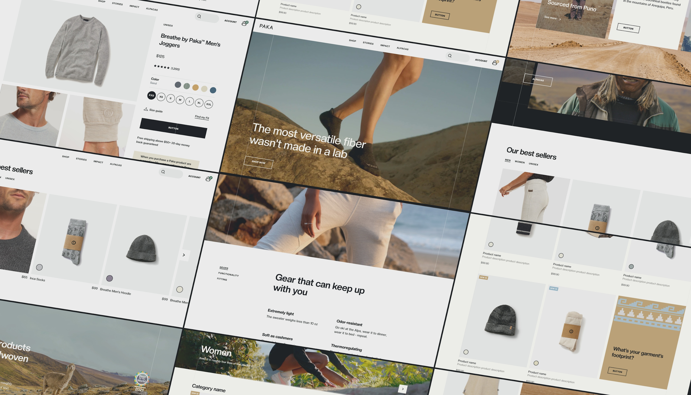
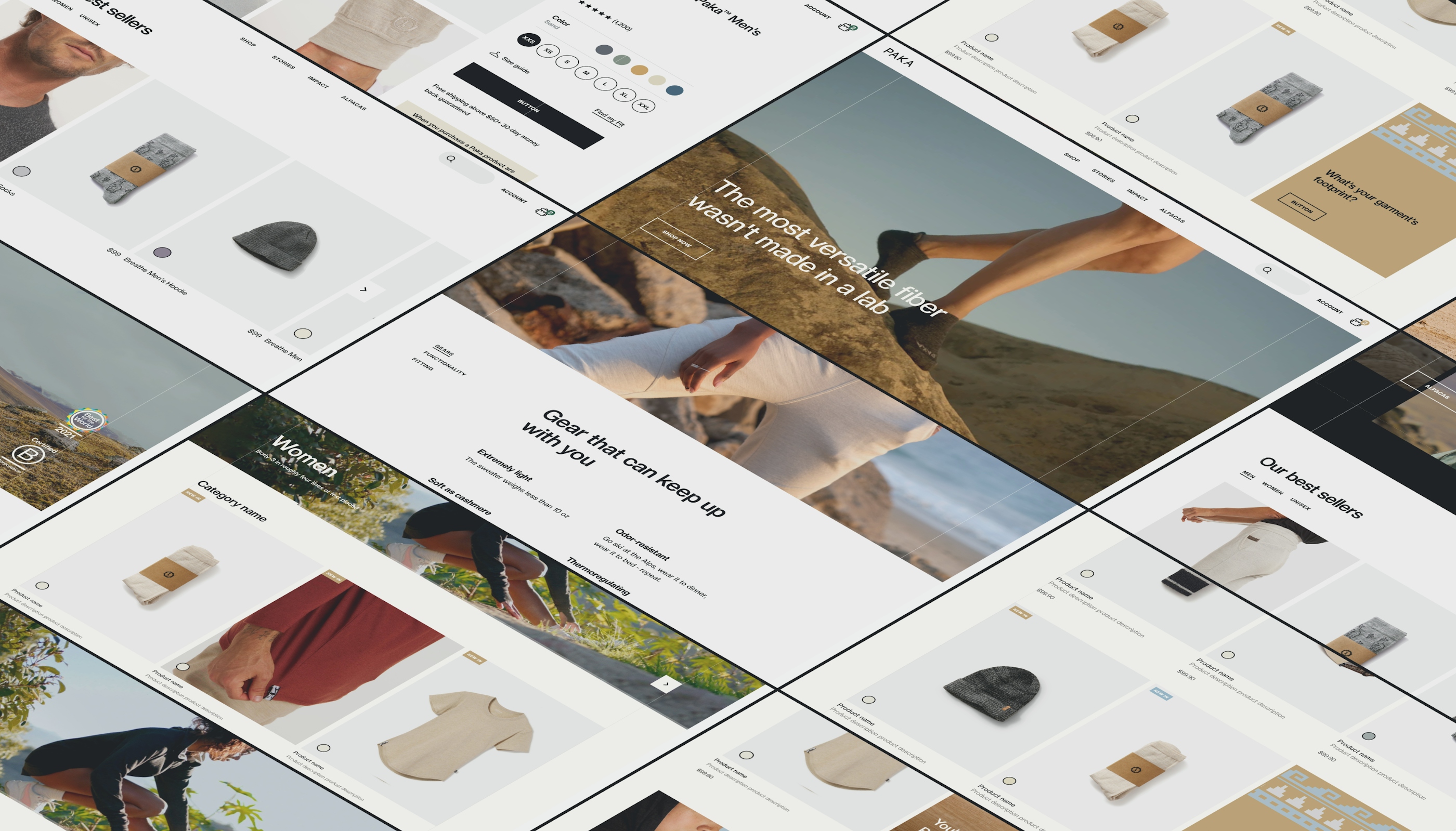
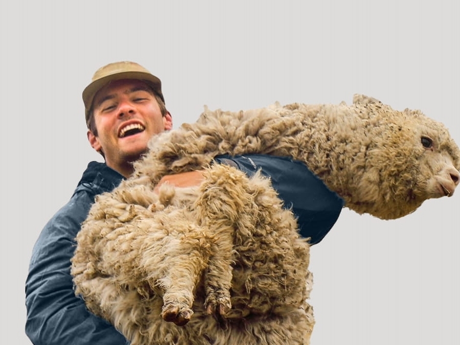
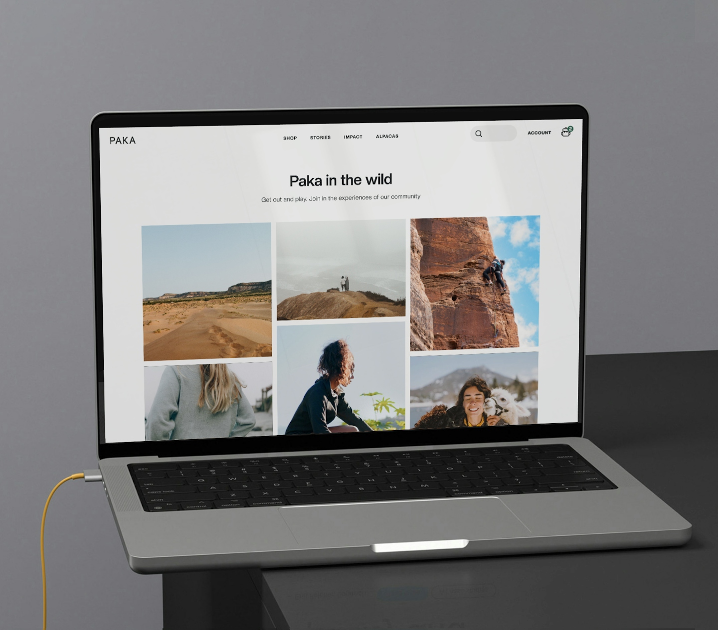
One of our main objectives for the site was to truly celebrate the things that make Paka, Paka. From the beautiful landscapes of Peru and Sebastian to the Inca ID, the site is peppered with these cues so no detail goes unbranded. We took heavy inspiration from the Inca ID to create assets such as the hovered states of buttons and category cards, bullet points, and decorative banners. It’s an integral part to Paka’s identity and an homage to the Incan artistry Paka works to keep alive.
So intuitive you don’t even have to think
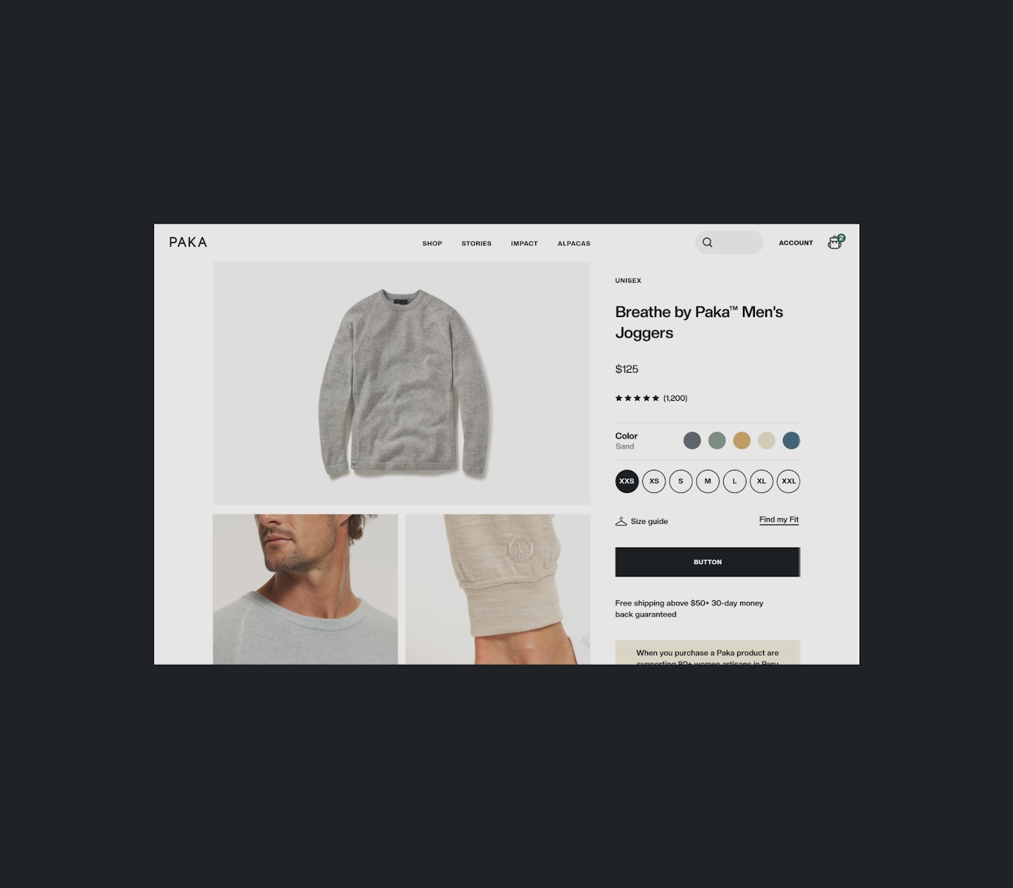
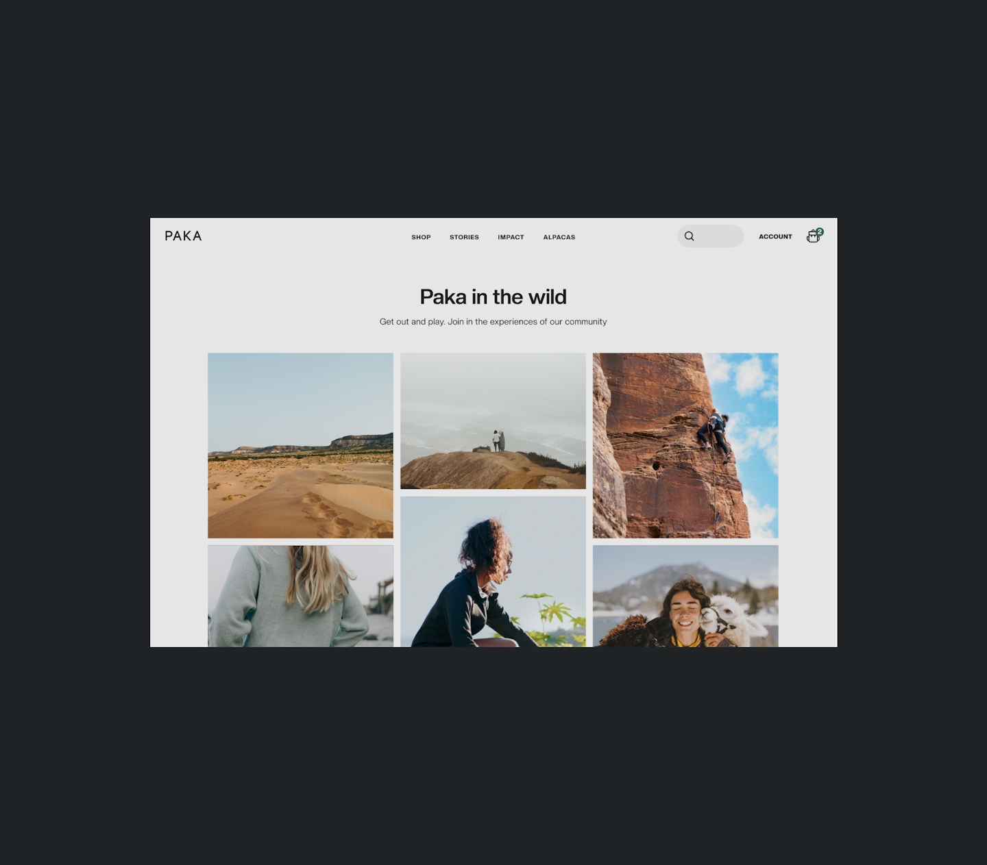
The site is designed to help customers learn about Paka and make decisions quickly. We wanted to reduce friction in the shopping process and ensure that all possible questions are quickly answered; plus, answering questions that hasn’t been asked. Our intention was to package functionality with an immersive aesthetic - something out-of-the-box but still straightforward enough that customers don’t get lost. More importantly, we don’t want them to think at all.
Design components
The site is designed to help customers learn about Paka and make decisions quickly. We wanted to reduce friction in the shopping process and ensure that all possible questions are quickly answered; plus, answering questions that hasn’t been asked. Our intention was to package functionality with an immersive aesthetic - something out-of-the-box but still straightforward enough that customers don’t get lost. More importantly, we don’t want them to think at all.
.


Revenue increased 280% in 2 months
With the help of the entire team at Paka, we were able to successfully design a site that lived up to its performance while still looking great. Within 2 months or so, the new Paka homepage and Product Details page increased conversion rates by 0.72% and brought in 280% more revenue.
